Buttons are amazing. With a single touch, a button gives life to a website, application, or any digital product. The importance of these elements in the tech evolution has already been summed up in this quote: "What must it be like, I wonder, to live in a world where food appears at the press of a button?"(by Suzanne Collins), that I find really powerful.
Buttons are an essential element of web design. Basically, buttons are styled links that grab the users’ attention. They help users navigate our websites or apps and drive them to a particular action like submitting a contact form, or placing an order as easy as possible.
Being aware of all this, I've approached the role of the button in UI/UX design in my new book "Fundamentals of Creating a Great UI/UX" and, below, I want to share 5 Tips that will help web designers and developers create awesome buttons. In addition, in this article, I've also shared some useful information about:
- Button's history
- Button's anatomy
- Button's state
Buttons Evolution
The history of the button starts with the web's history and its predecessor is the simple link with a call-to-action as anchor text. Although buttons look like very simple UI elements, their design has changed a lot over the past decades.
We’ve seen buttons evolve from mimicking the Windows operating system to large flat buttons with fully rounded corners ⬇️

Button’s Anatomy

Here are the essential properties of a Button in the above image. Let’s take a closer look at each property.
- Border Radius: The most common shape of buttons is square and square with rounded corners. The rounded corners are created by setting the value for border radius. The more you increase the corner radius, the more friendly button starts to look.
- Text: Depending on the situation, it can be replaced with an icon.
- Padding: It is the space around an element’s content, inside of any defined borders.
- Shadow creates volume and draws attention to the buttons.
- Color: It helps the user anticipate what information the button will transmit. Usually, blue is for info, green is for success, yellow is for warning, and red is for danger or error.
- Margin: They are used to create space around elements outside of any defined borders.
- Labels: They are defined by font-family, size, weight, and color.
Button’s State
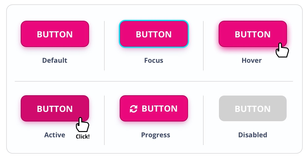
Button states let the user know whether they can click or have clicked, or had successfully clicked a button. Let's see them:
-
Focus State - This state is visible when the user has highlighted the button using a keyboard or other input method.
-
Hover State - This state is visible when the user has placed a cursor above the button.
-
Active State - Active or pressed state is visible when the user had clicked or tapped on the button.
-
Progress State - This state is used when an action is not performed immediately and communicates that the button is in the progress of completing the action.
-
Disabled State - This state is used when the button is currently non-interactive, but it can be enabled in the future.
Our Book was Sold Out. Second batch coming soon!
Tips For Creating Awesome Buttons
1. Text Size - The perfect text size for web and mobile is 16pt. It could be more than that, but a smaller size can affect the UX.

2. Width - Don’t make the button too wide or too narrow. For web the perfect padding is 32px. For mobile the size could be extended for full screen width.

3. Height- Don’t make the button too high or too low. For web and mobile, the perfect padding is 18px.

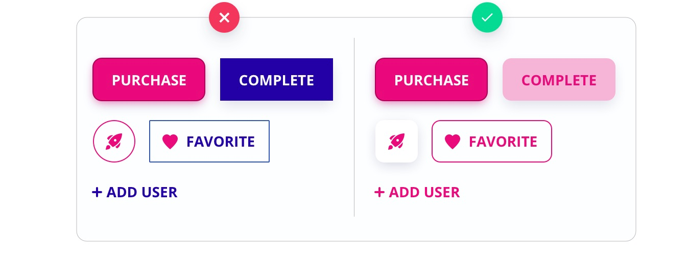
4. Consistency - The consistency between buttons is essential, so it is relevant that primary, secondary, and tertiary buttons have common elements like border radius, typography, and shadow.
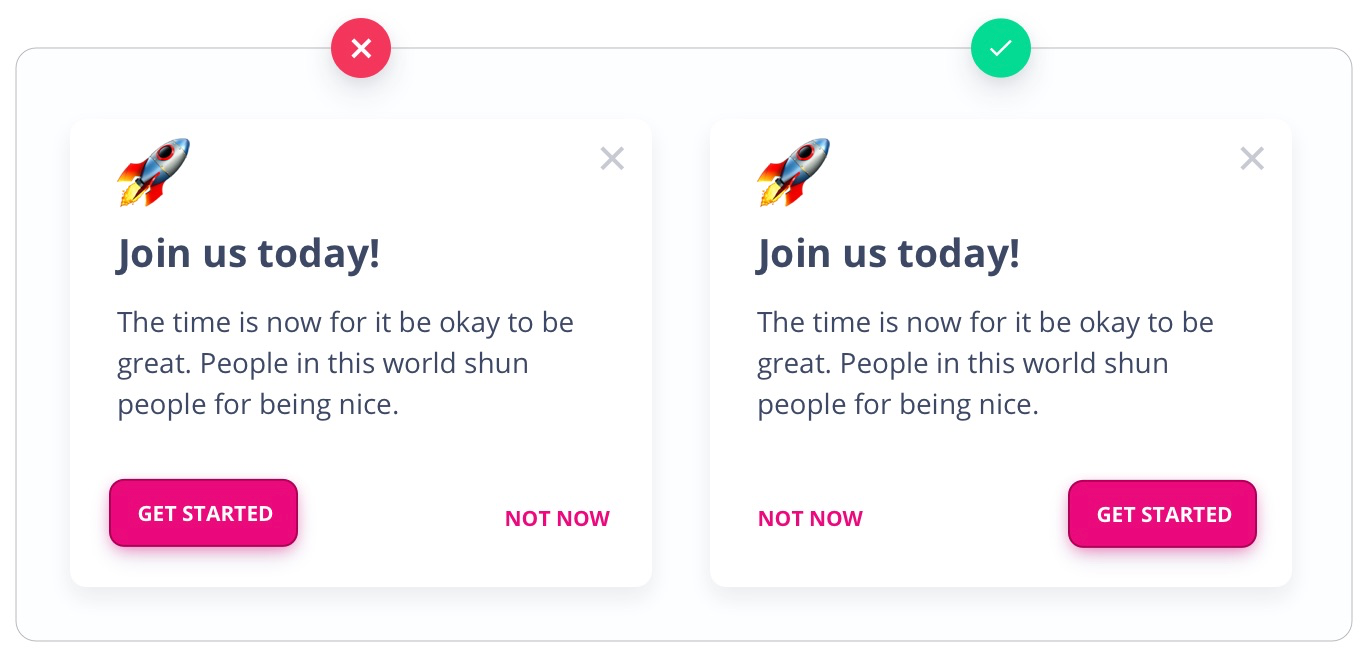
5. Placement - According to the predictability of the human eye, there are certain points of interest and the user's eye is formed to find them because there are the same patterns and trends. For this reason, it is important to place the button where the human eye is used to finding it.
Summing up
Thanks for reading this article!
If you are interested in learning more insights about designing web pages and mobile apps, we wrote a UI/UX Design Book. Fundamentals of Creating a Great UI/UX by Creative Tim includes six parts (chapters) that walk the reader through the process of designing a website from the basic elements like buttons, cards to the macro elements like sections and pages.
After reading our book, you will learn how to Design & Use all the UI/UX design components for your Web Pages & Mobile Apps.
Special takeaway: Here is your 30% Off coupon to use with the Digital Version of our book for being an awesome reader of our blog! 😍
