We just shipped 5 new editorial blocks, and they're different from anything we've built before.
The difference isn't the design. It's how the typography works under the hood.
These blocks use a tiny JavaScript library called Pretext that solves problems CSS can't solve. Not "can't solve elegantly" or "can't solve without hacks"; genuinely can't solve at all.
Text wrapping around irregular shapes. Columns that balance their heights pixel-perfectly. Lines that flow around letterforms. The kind of stuff you see in print magazines that's been impossible on the web without manual tweaking.
We spent the last month building with Pretext, and here's what came out of it.
What Pretext Actually Does
CSS can flow text into rectangles. That's it. If you want text to wrap around a photo with an irregular edge, or balance columns by measuring their rendered heights, or make body copy hug the contour of a giant letter, you're out of luck. CSS just doesn't have those primitives.
Pretext renders text to an invisible canvas, measures every glyph at the pixel level, and gives you APIs to route content line-by-line around obstacles. It's not a layout engine, it's a measurement layer that sits between your content and the DOM.
The library is 8KB. One developer. No dependencies. It does one thing extremely well.
We've been watching it evolve since early 2026, and when we saw what it could do, we knew we had to build something with it.
The Five Blocks
1. Magazine Text Wrap
Text flowing around a right-floated photograph. Not the fake kind where you set a fixed width and hope for the best. Actual line-by-line reflow where each line's width adjusts as it passes the image boundary.
Pretext's layoutNextLine() measures the available space for each line and routes the text accordingly. When the line is in the image zone, it narrows. Below the image, it returns to full width. Pixel-perfect at any viewport size.
This is what print designers have been doing for decades. Now it works on the web.
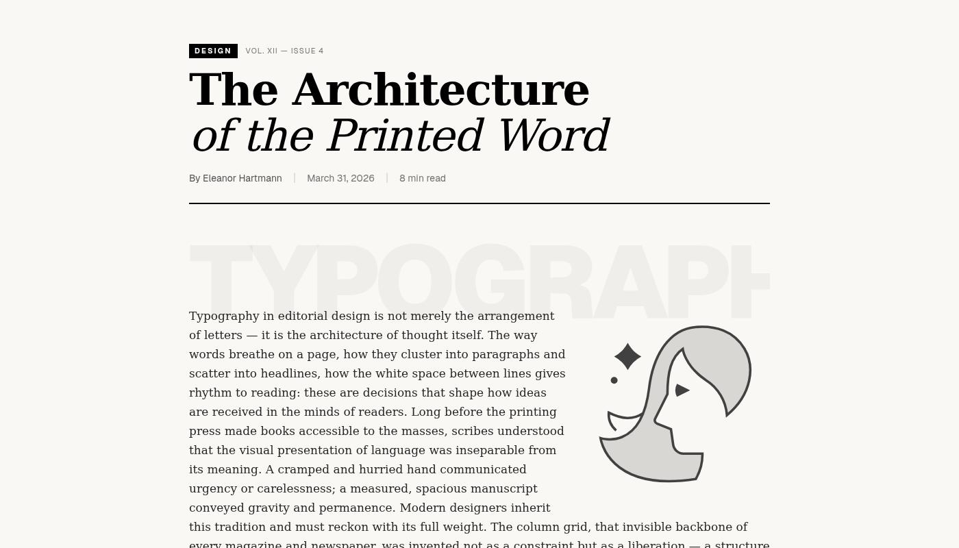
2. Magazine Oversized Words
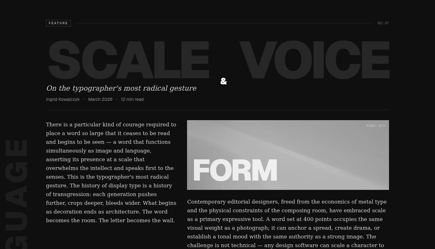
Dark editorial spread with giant ghost words: "SCALE", "VOICE", "LANGUAGE", "FORM". The kind of layout you see in Vogue or Kinfolk.
The body text flows in two columns, and every line is positioned as an individual absolute span. Pretext's prepareWithSegments() breaks the text into chunks and measures each one, so we can place them precisely around the oversized typography.
CSS can't do this because it doesn't know where the words are until after the layout happens. Pretext measures first, then positions.
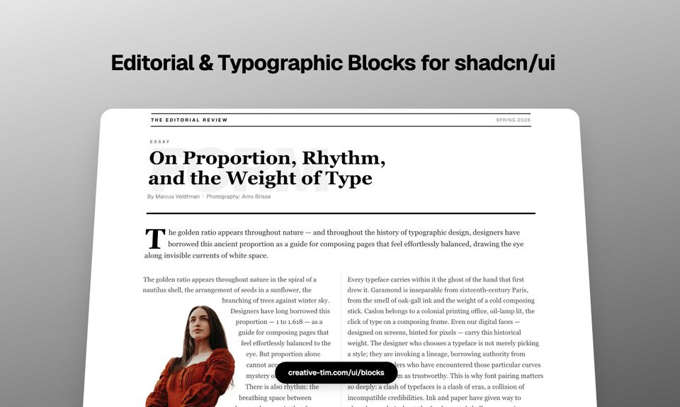
3. Magazine Editorial Columns
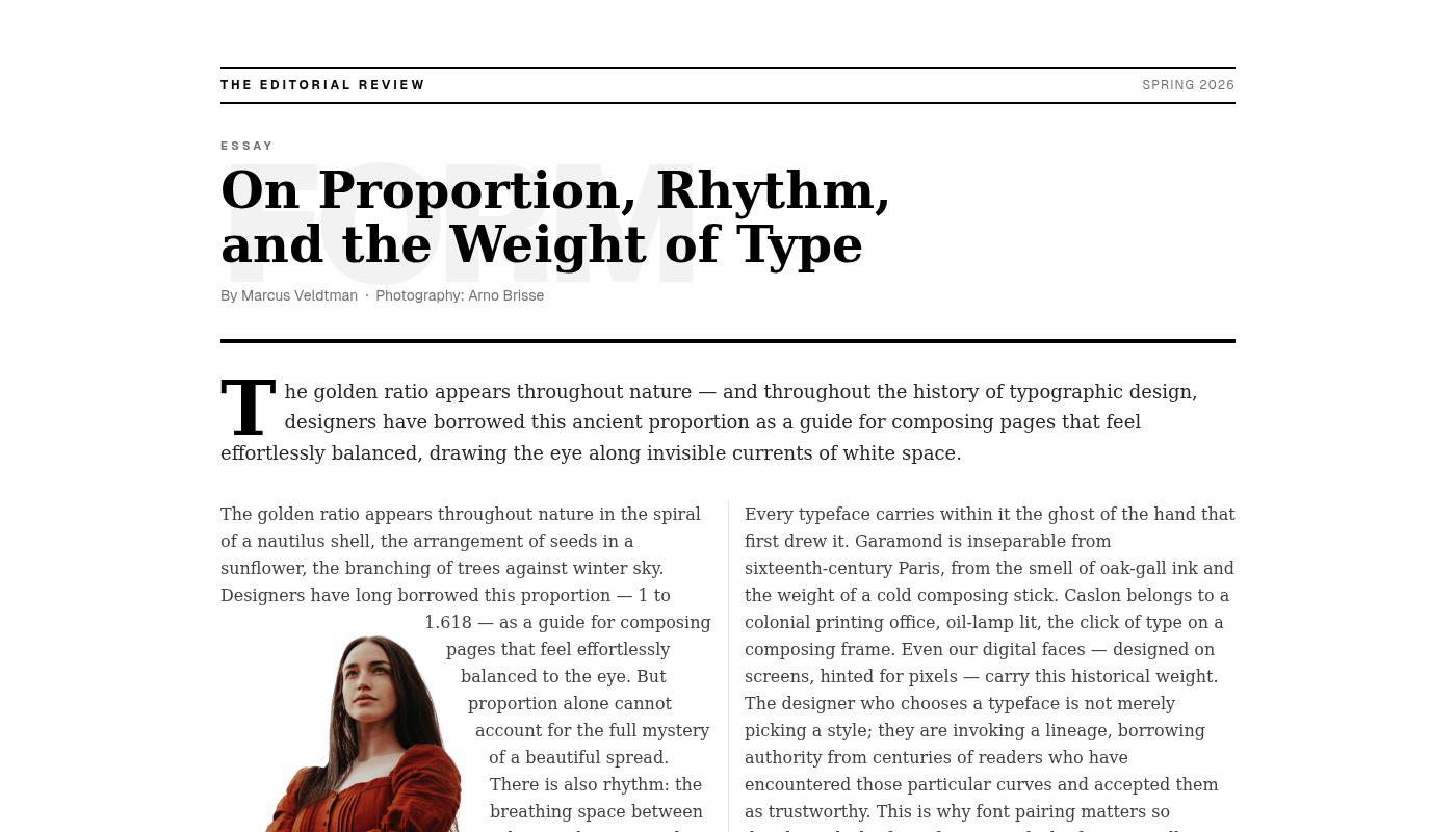
Three-column layout with balanced heights. Not "roughly the same", exactly equalized down to the pixel.
Pretext's layout() function measures the rendered height of each column and redistributes content until they match. CSS multi-column can approximate this, but it reflowed everything and often gets it wrong. Pretext measures, calculates, and positions.
Includes a masthead bar, drop cap on the intro paragraph, full-width pull quote, Roman numeral column labels, and a typographic footer. The kind of editorial treatment you'd see in a long-form magazine feature.
4. Magazine Big Letter
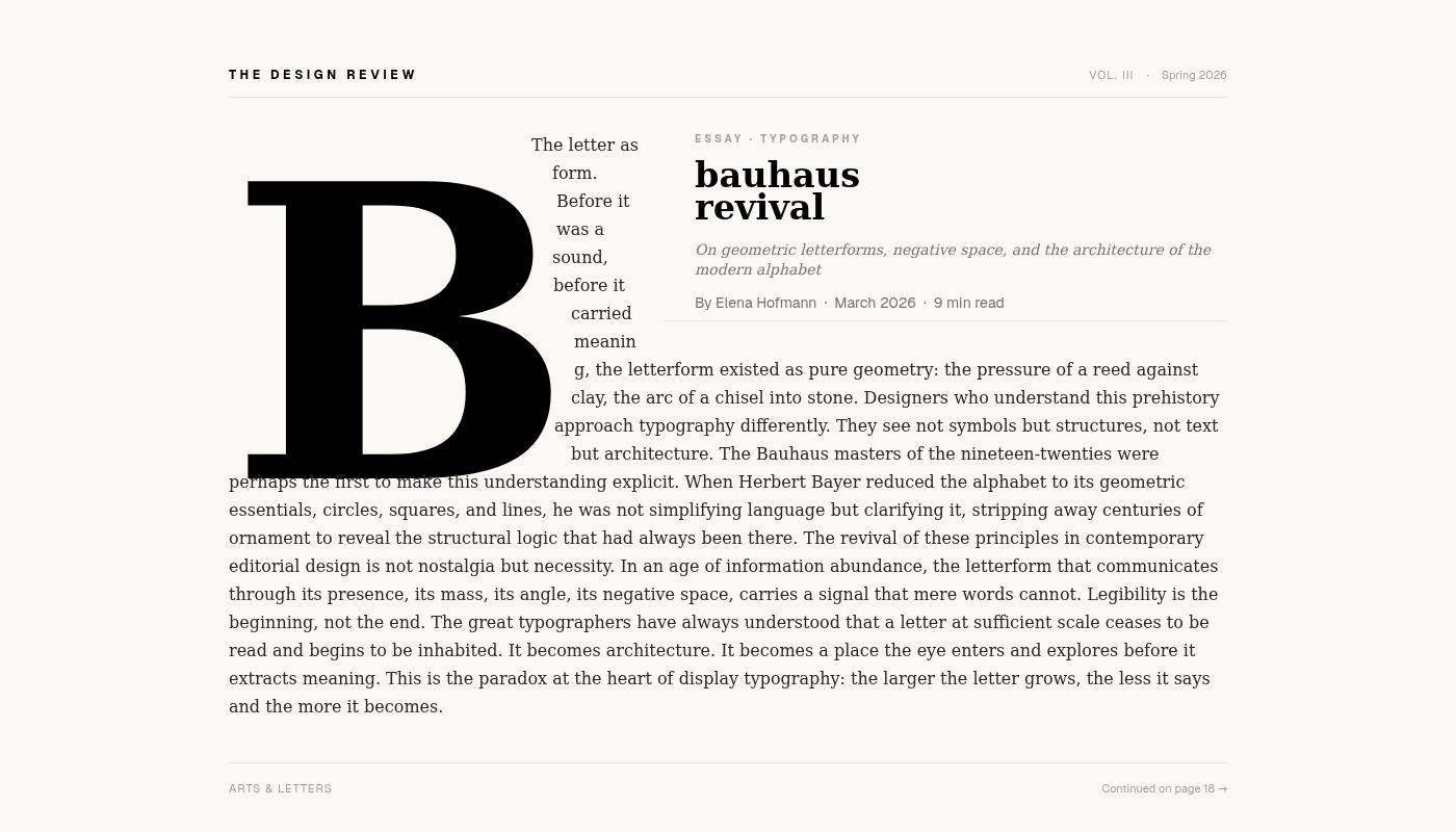
A giant letter "B" with body text wrapping around its silhouette.
This one required something wild. We rasterize the letter to an OffscreenCanvas at runtime, extract a polygon hull of its exact typographic shape, and feed that to Pretext. Then layoutNextLine() flows the text line-by-line to the right of the letter, carving each line's left boundary to hug the letterform.
The upper-right quadrant reserves space for a static editorial title by adding a blocker interval during the title zone. Two obstacles, one text flow.
Inspired by Bauhaus revival layouts. Impossible without canvas measurement.
5. Magazine Image Columns
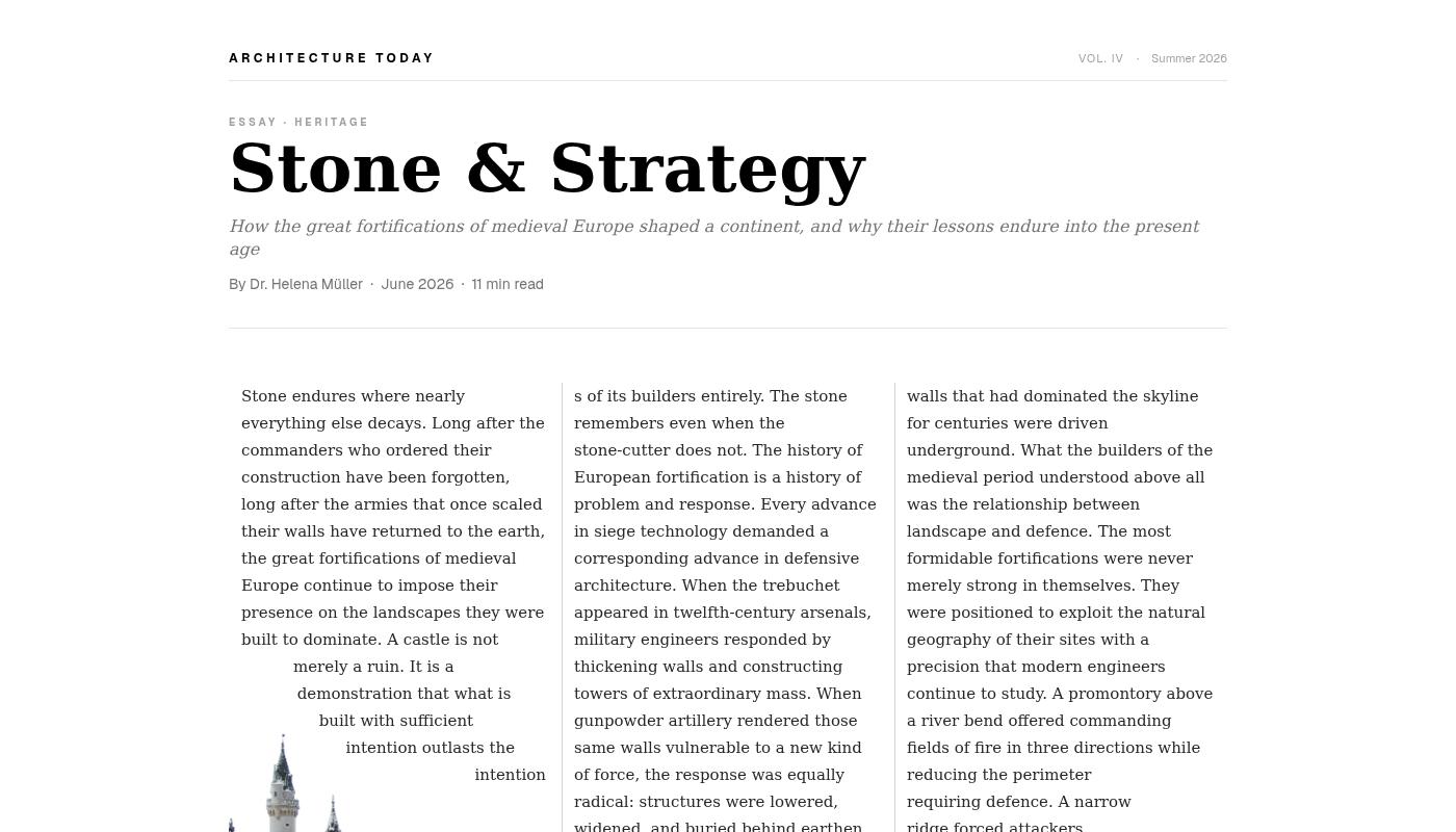
Full-bleed landscape photograph anchored to the bottom. Three floating white text columns above, each stopping organically where the castle silhouette rises to meet the text.
The columns flow until they hit the image boundary, then stop. No fixed heights. No JavaScript scroll listeners. Just Pretext measuring the available space and placing each line accordingly.
This is the kind of effect you'd build manually in InDesign. Now it's a component.
Why This Matters
We've been building UI components for over a decade. Thousands of blocks, hundreds of templates, every framework you can think of. Most of it is variations on CSS primitives: grids, flexbox, positioning.
These editorial blocks are different. They do things CSS fundamentally can't do because they measure typography at the glyph level and route content programmatically.
The tradeoff is JavaScript. These blocks aren't static HTML and CSS. They run Pretext on mount, measure the text, and update the DOM with positioned elements. That means a brief flash before the layout settles, and a dependency on client-side rendering.
But the upside is real editorial control. The kind of typography you see in print, working responsively on the web.
Building with Pretext
The API is surprisingly clean. You give it a canvas context, a font, and some text. It gives you back measurements.
For simple text wrap:
const line = layoutNextLine(context, availableWidth, text)
For multi-column balancing:
const columns = layout(context, columnWidth, text, { targetHeight })
For obstacle avoidance:
const line = layoutNextLine(context, availableWidth, text, { blockers })
The library doesn't touch the DOM. It just measures and returns data. You decide how to render it.
We render everything as absolutely positioned spans. Not semantic. Not accessible by default. But pixel-perfect.
For production use, you'd want to pair this with proper semantic HTML for screen readers and search engines. Render the visual layer with Pretext, keep the content layer as plain text.
What's Next
We're adding these blocks to our shadcn/ui registry alongside the rest of our component library. They work with React, Next.js, and any framework that supports client-side rendering.
If you're building editorial sites, long-form content, or anything that needs magazine-quality typography on the web, try them out. Each block is a starting point, designed to be customized, remixed, and adapted to your content.
Pretext is still early. The library is solid, but the ecosystem is small. We're one of the first design systems to ship production components built on it. If this kind of typography control matters to your project, we'd love to hear what you build with it.
Find the blocks here: creative-tim.com/ui/blocks/content-ui/editorial
Links:
- Pretext library: github.com/chenglou/pretext
- Editorial blocks: creative-tim.com/ui/blocks/content-ui/editorial
- Our component registry: creative-tim.com/ui
Contact:
- Twitter/X: @axelut
- Twitter/X: @creativetim