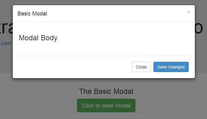
What is a Bootstrap Modal?
The Bootstrap 4 Modal is a flexible and responsive JavaScript popup, dialog or alert window. Websites that are built over Bootstrap can use the modal to display videos, images or social media buttons. The Bootstrap Modal popup can be easily closed by clicking on the close button or by clicking outside the modal window.

How to create a basic Modal?
The following example shows how to create a basic modal:
https://gist.github.com/DianaEC/b61c2fb0e894237ef1bfa6d3874eab08
Modal size
Modals have a default size of medium. You can change the size by adding “.modal-lg” or “.modal-sm” class to the “.modal-dialog” class.
Small size
The code for smaller modal box:
https://gist.github.com/DianaEC/7104833a11ecb4ee99603e2c7e794ea9

Larger size
The code for larger modal box:
https://gist.github.com/DianaEC/e30a09f3aafda8716443468bc3b2ce8f

Remove animation
If you want to remove the fade-in/fade-out effect, you have to remove the .fade class from your modal markup.
https://gist.github.com/DianaEC/5a54ef6008dabd0653d1c20a6f521d74
Bootstrap modal’s events
You can customize the behavior of the Bootstrap modal by using various events that are triggered while opening and closing the modal. These events have to be bound using jQuery’s .on()method.
-
-
- show.bs.modal: → before the modal is open.
- shown.bs.modal: → after the modal is shown.
- hide.bs.modal: → before the modal is hidden.
- hidden.bs.modal:→ after the modal is closed.
- loaded.bs.modal: → when remote content is successfully loaded in the modal’s content area using the
remoteoption mentioned above.
-
Example:
https://gist.github.com/DianaEC/ba0137e23c4546bbde3ef8d169385327


![15+ Top Black Friday & Cyber Monday Deals for Developers and Designers [2023]](/blog/content/images/size/w960/2021/11/black-friday-deals-developers-1.jpg)
