Web developers have a specialized skill set and it doesn’t necessarily include marketing. But, when you’re working with an eCommerce client, or you run your own online store, the shopping cart flow is a critical piece of the development puzzle. So, rather than going out and getting a new certification in sales or marketing, you can learn the basics of what it takes to streamline the shopping cart flow process right away.
Why is the Shopping Cart Flow Crucial for Your Website Design?
A complicated checkout process is the third most frequent reason why online consumers abandon their shopping cart in the middle of a transaction. 27% of shopping cart abandonment is attributed to this. So, over-complication can lead to a dramatic decrease in online sales.
Let’s crunch some numbers. Imagine that a client brings in about $150,000 in eCommerce sales each month. Their shopping cart abandonment rate is 37%. The company already offers free shipping and allows guests to make a purchase without registering on their site. They have optimized their site speed and there seem to be no site crashes (these are the other main reasons why a customer might abandon their shopping cart). The next area to look at is the checkout process.
So, let’s say you take a few days to optimize the shopping cart flow and find that the abandonment rate decreases to just 20%. That could lead to a monthly sales increase of $25,500 and an annual increase of $306,000.
Even if the site isn’t otherwise optimized, updating the flow, in the above scenario, could hypothetically improve the abandonment rate to 34%. This simple 3% conversion rate increase could raise the projected annual online profits by $54,000.
Your goal as a developer isn’t just to give the eCommerce experience an aesthetic appeal. You need to invest ample energy into user experience (UX) as well. Creating a flow that is easy and efficient can either make or break conversions for your eCommerce.
So Where Do You Begin?
Now that you understand why an optimized shopping cart flow is necessary, it’s time to learn what it takes to create a simple, well-designed checkout process for your customers. Here’s everything you need to know.
Looking at relevant mobile marketing data from Smart Insights’ 2016 mobile marketing compilation, we found that, in the United States, 4.85% of online retail conversions take place on a smartphone or tablet. 51% of consumers time spent online is from a mobile device. More people’s shopping habits take the form of an omnichannel (both mobile and desktop) approach than desktop or mobile-only.

[Shopify themes provide responsive shopping carts]
So, your shopping cart, like the rest of your website, needs to have a responsive design – it needs to function seamlessly via mobile and desktop. This is why leading eCommerce themes, like those from Shopify and others, have built-in, responsive shopping carts. If you’re building your own cart, make sure that you test it on both mobile and desktop devices.
How Many Pages Should Your Checkout Flow Include?
Obviously, there are several steps during the checkout process: Login/ registration, delivery information, payment, order verification, and order placement. Should you include a separate page for each step? The answer is not necessarily.
Some eCommerce sites include a separate page for each step, and some include the entire process in one page. The key to the checkout flow isn’t in how many pages it includes, but whether it is clear and linear. Do not confuse customers with too much information, but address their potential concerns along the way.
Here’s what you need to know about each step of the checkout process:
- Login/ registration – 86% of consumers are annoyed by having to create a new account to complete a transaction, and 96% would rather leave your site than go through the hassle of retrieving lost password information. Rather than not requiring user login, you can use a social login to appeal to the majority of online shoppers.

[Thredup.com provides a social sign up option for shoppers]
- Delivery & payment information – 17% of shoppers are concerned with payment security. So, when accepting personal information from customers, include a trust badge from your checkout security provider on any page where you collect information from the customer and provide an easy-to-find link to your privacy policies. Never agree to sell customer information to third parties.
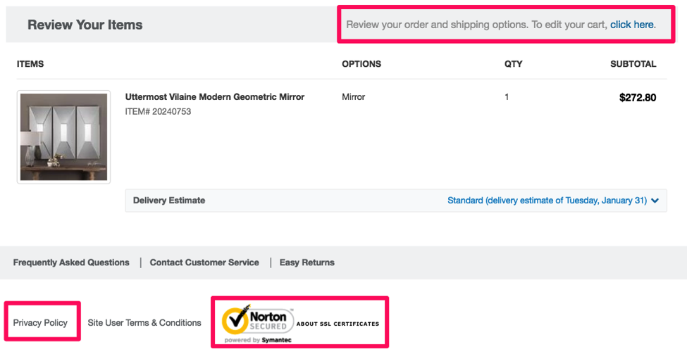
- Order details verification – The purpose of this verification is to give your customers one last chance to check whether their ordering information is correct. They may want to update their address, payment method, the number of items in a cart, or other details. On the order verification page, provide links that allow customers to edit their order.

[Overstock.com includes a privacy policy link, Norton trust badge, and a link to edit cart details.]
- Order placement – Placing the order should be pretty cut and dry. This is usually accomplished through a button that sends the customer to a screen confirming the purchase. On this page, provide the confirmation, details about order cancellation and returns, and let them know that they will receive an email with the order details to confirm the purchase.
Shopping online from some of the authorities in online retail could provide you with real-life insights that you haven’t considered, so take some time, when designing your flow, to also look at others.

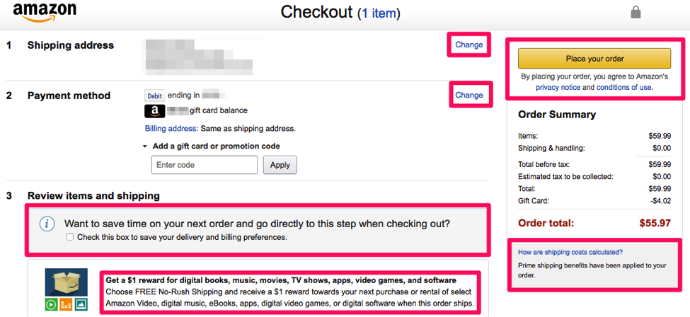
[Amazon.com has a fully-optimized checkout experience for registered users]
Amazon.com, the world’s leading eCommerce website, provides the option to store customer information, allowing easy checkout, on one page, with the click of a button. Still, they provide links to optional actions like changing the shipping address or payment method, storing personal information for next time, taking advantage of promotions, and learning more about shipping and privacy policies. By doing this, they simplify the checkout process and still address all potential shopping concerns.
Conclusion
The shopping cart flow is a critical element of the eCommerce UX. We hope this article will help you optimize the checkout flow. Do you have any other advice for creating a high-converting online shopping experience? Please share it in the comments below.
Author’s Bio:
Jared Carrizales runs the team at Heroic Search in Tulsa and Dallas. They handle content marketing, social advertising, and digital public relations. Jared has worked in the digital marketing realm for the past 9 years and has the bruises to prove it.


![15+ Top Black Friday & Cyber Monday Deals for Developers and Designers [2023]](/blog/content/images/size/w960/2021/11/black-friday-deals-developers-1.jpg)
