Trends reflect people’s behavior and needs in any industry by hook or crook. And mobile app development isn’t an exception. This process of modifications seems to have no limits. Technologies have recently become the leader of human progress as well as are the main driving force for changes. Let’s look back at 2017. This was a significant year for app development with everything from product interfaces and focus on the content for various digital platforms.
2018 is going to develop the trends of the last year focusing on accessibility and concept of user-friendly design. A user-friendly design will be the prime mover for innovations and business success in 2018. With that being said above, here are some of the UX/ UI trends to keep close tabs in 2018.
Content is still king
Of course, there are a dime a dozen of tools to make your software product look awesome. But why users download an app? Because of the content, it provides. It’s evident that content should be a big part of the design. It should be well-edited and easily accessible for users. Try to find the right mix of technology and content. There are a few rules to follow when it comes to content for mobile apps:
- Remove useless content
- Add only essential information
- Focus on important data
Minimalism
The product design is evolving and receding the old design approaches. In 2018 the design will be more user-focused than ever before. Every app should be created for users first. And what do users expect an app to be? Fast and useful.
The concept of speed doesn’t only regard the technical side of a mobile application. If an app has too many design elements, it might confuse users. A minimalistic design can make the whole user experience more accessible. The product without any tinsel will definitely move forward and attract new users.
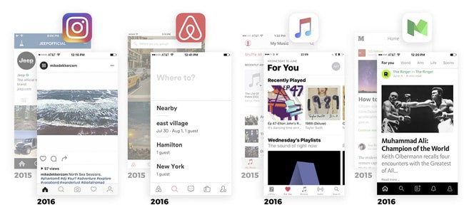
The features that define the hottest design trend of Silicon Valley:
- Remove colors
- Bolder and bigger headlines
- More whitespace
- Simple and recognizable icons
Credits: Michael Horton
Speaking about color schemes, “less is better” concept also reside for colors. You might have already noticed that most of the favorite apps have one primary color and a couple of its shades. And such apps look amazing, don’t they?
Go for material design
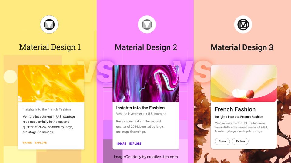
It was not until 2014 when the concept of material design appeared. Google Inc developed this idea. Material Design has undergone a wide range of changes since its first launch. And like any design concept, Material Design has its own goals and missions. It calls for a simple application that uses its space efficiently.
Nowadays Material Design has established itself as the most flexible design solution taking advantage of dark and light backgrounds. Its general simplicity gives more space for innovations and creativity. The concept creates a so-called diversity of colors and functionality letting designers add more features to mobile apps.
Multiple gestures
A couple of years ago, sensory smartphones were ridiculous since they have practically no buttons. But the things change at the rapid pace, especially in the mobile world. And nowadays a simple tap isn’t a surprise for users.
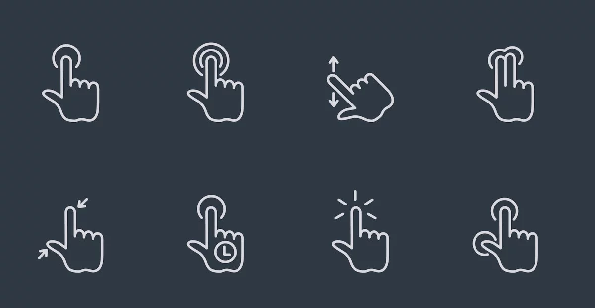
Modern smartphones have a wide range of gestures – drag, pinch, tap and press, double tap, press, and hold, etc.
Credits: TNW
And what a surprise it could be to find a new gesture command in mobile apps. Designers have too early assumed that they have taken everything out of in-app gesticulation. Moreover, gestures are more efficient when compared to buttons because:
- Gestures make the user experience more real when playing games
- Gestures are much faster than buttons
New tools for mobile navigation
The diversity of mobile screens has brought more challenges for designers since they have to produce the UX/ UI design to suit all screens. Phablets appeared not so long ago and changed the way people interact with mobile devices.
The primary challenge is to place all necessary areas at a thumb length regardless of screen size. Designers try to gather all essential elements at the bottom of the screen. But it’s only the first step in design for phablets since this type of navigation still needs more improvements.
Functional animation
When it comes to interaction with users, animations are clear winners. Useful animations let users immerse in the app. Moreover, animations aren’t about vivification for entertaining, they are here to help users follow the logic context.
Animations come in handy when you develop a multitasking app since they can make users understand the app. There are some situations when the app can’t go without animations at all. Animated responses, visual effects, zooming, and other fancy tricks can add more value to your app.
Augmented and virtual realities
There is hardly ever an individual who has never heard about VR and AR, right? Many of us have not only heard but even tested VR and AR technologies. But in the perspective of design, AR and VR are pretty young.
PokemonGo and Snapchat have ushered the beginning of a new era in the app development. As for UX parts of the work with both AR and VR, there are some points to consider. We’re going to shed more light on the UX challenges while working with AR and VR in our next coverage.
New trends stand for new opportunities
You have probably noticed that each current trend somehow improves the previous user experience and adds more yet unused features. UX/ UI designers along with mobile developers create our present world and change our future.
As the time goes, the things that seemed unreal a couple of years ago like sensory smartphones, Touch ID, AR and VR technologies have become a part of our daily life.
Short Bio
Helen Morrice is a technical writer at IDAP Group, a web and mobile app development company. She’s a content goddess. Helen creates engaging copies for non-tech people. Don’t forget to like the article on Facebook.


![15+ Top Black Friday & Cyber Monday Deals for Developers and Designers [2023]](/blog/content/images/size/w960/2021/11/black-friday-deals-developers-1.jpg)
