Up until just a few years ago, Apple reigned supreme in the high-tech design world. Nobody else could touch the company or compete on the same level. High quality, well-planned design was at the core of who Apple was as a company. Conversely, Google and Microsoft were founded by intelligent engineers that focused on simplicity and efficiency.
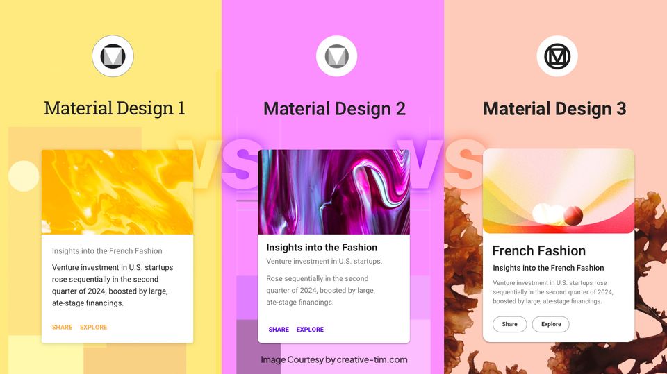
That all changed just a few years ago however. Both Google and Microsoft woke up to the reality that great design is a competitive advantage – and they had a lot of catching up to do. Google released their Material design, and although they themselves are not the best at implementing, it’s nevertheless a huge improvement over what they had in the past. While still catching up to the pedigree of Apple, Google seems to be making more of an effort to spread their language far and wide.
Microsoft as well has been making leaps and bounds in their own design. Even though they can both be considered flops, both Zune and the Windows 8 products pushed the idea of a new design language. Initially their design was called Metro, but is now called Microsoft Design. Microsoft seeks to unify its wide range of devices and platforms into one cohesive design language, which is starting to show.
The infographic below from Coastal Creative shows the differences and similarities between these three tech giants, and who’s winning the design wars in 2015:
Image source: Coastal Creative


![15+ Top Black Friday & Cyber Monday Deals for Developers and Designers [2023]](/blog/content/images/size/w960/2021/11/black-friday-deals-developers-1.jpg)
