There is a new design for Android and it is called ‘Material’. It has been introduced at the Google IO developer week and has been regarded as a breakthrough ever since. The new design language is looking to blur out the difference between the web and apps and make for an unified experience.
The philosophy behind the design
Although the guidelines have been released fairly recently, it’s been said that the idea came years before. It’s more than likely a ‘need’ than a revolutionary ‘idea’. Google products have always had inconsistent design and lacked rules that make sense.
The new design has elements that have been the result of research regarding ink and paper and the way objects and materials interact in real life. The result is a strategy description and a few resources that they give away. This first step was definitely necessary as development moves into a wider area. Design across wearables, mobile, desktop and TV need to be consistent and leave the impression of visually similar elements. But it is surely not enough to make a difference to current products. The Google ‘Material’ redesign is expected to happen late this year and we are curious to see the actual result and how it will propagate to developers.
What you Should take from Material Design
After in-depth reading and research of the material design, we made a short summary of great concepts that can be integrated in your current work and produce better results. The need for more documents that cite general guidelines is huge. People that create technology products need to go back to the roots and find out what information makes sense in a world full of endless possibilities of visual organization.
So, let’s go through the general design guidelines of Material Design and how you can recreate it in your project. The detailed explanations are very well described in the Google Manifesto you can find at Google Guidelines.
Principles
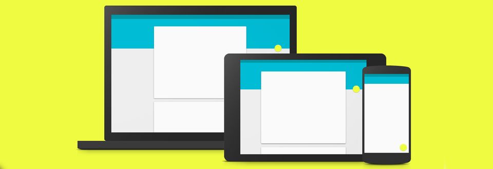
The main idea of the Material Design is having an underlying structure spanning across devices. It makes use of light, surface, and movement. It uses a deliberate color choice, edge-to-edge imagery, and large scale typography. It promotes core functionalities, so they become apparent instantly.
Layout
The general layout resembles sheets of paper. You should try to imagine how you would arrange different layers so that the depth and order are obvious. Try to keep navigation on the left and actions on the right. Toolbars look the best as an extra layer in the top section. Don’t forget to ‘pull the furniture off the wall!’, that means you should give your containers padding and try to keep a clear view of the content.
Don’t forget that depth is not ornament and the larger screen doesn’t mean larger capacity of the brain, so think mobile first!
Shadows on the top are for depth and below for definition of the element. Put the content forward and define dividers where necessary. Avoid L-shaped containers at all costs!
Style
Use bold shadows and highlights. Go overboard with vibrant colors and place attention on an accent color!
Animation
Make sense of gentle acceleration and don’t surprise the user with elements coming out of the blue. Enter and exit at peak velocity, let the paper have both a surface and a material reaction. Introduce the elements in the order of importance with consistent movements!
Typography & Icons
Use Roboto, you can find it here: Google Roboto Free Resource and mainly go with simple, rounded and consistent icons.
Pictures
Combine illustrations with images where possible, but don’t go overboard. And don’t use nasty stock photos that don’t say much about anything.
Buttons
There are 3 types of buttons you need: floating action buttons(like the infamous ‘+’) that describe a promoted action, the raised buttons that denote actions that should not get lost and flat buttons, mainly used in overlayers.
Use them carefully and with taste!
Cards
Represent single object and the actions associated with them. Don’t use cards when the content is not heavy or in homogeneous displays of information.
Failed Attempts so Far
The general guidelines have been fairly well explained and the examples are clear, but the design itself still doesn’t make sense. We took a look at first at the presentation page for the Material Design, and it doesn’t seem like it applies the principles.
There a detailed description of how animation needs to make the user feel comfortable and go smoothly inside the application, yet this is not implemented in the header, that goes from this:

Google Material Header 1
to this:

Google Material Design Header 2
in an instant and without animations.
The typography is said to have an ideal length of 60 characters, and yet, on long portions of the description Google has chosen to use at least 120 characters per line.
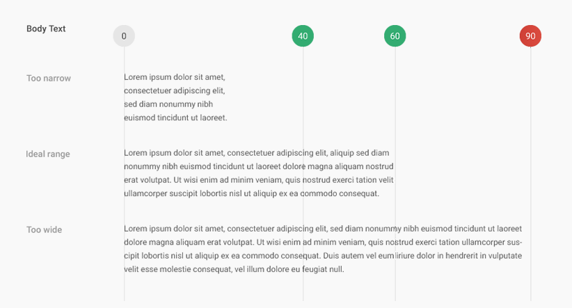
Google Material Design Typography

Google Material Design Description
It is unclear of whether this is because Google chose a font that is too small to read comfortably or because they forgot the rule they reinforce.
It is still unclear what the table of contents is doing after the small description for each chapter, since it can’t be used as navigation and does not describe where you are:
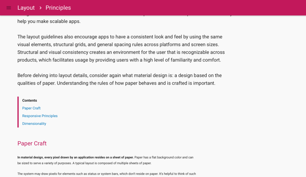
Google Material Design Table of Contents
And please, please Google try and use a sticky footer because when the page doesn’t have enough content it looks something like this:
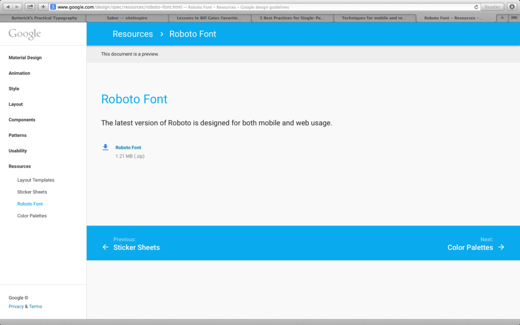
Google Material Design Sticky Footer
Thoughts on how to create a sticky footer can be found in this great tutorial: https://css-tricks.com/snippets/css/sticky-footer/
The burger icon in the top left opens a navigation and then leaves the page:
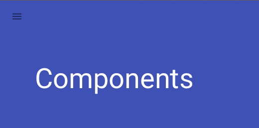
Google Material Design Navigation 1
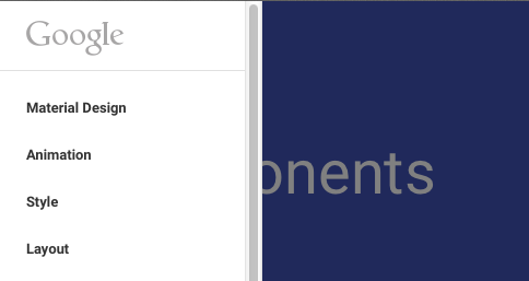
Google Material Design Navigation 2
The basic principles talk about how to turn it into a back arrow or, at least keep it in the page as a shared elements between transitions.
The negative examples are numerous regarding the Google tutorial page, but we should move on to another bad example of the Material Design, the Google Drive. After switching to the new design, the situation looks like this:
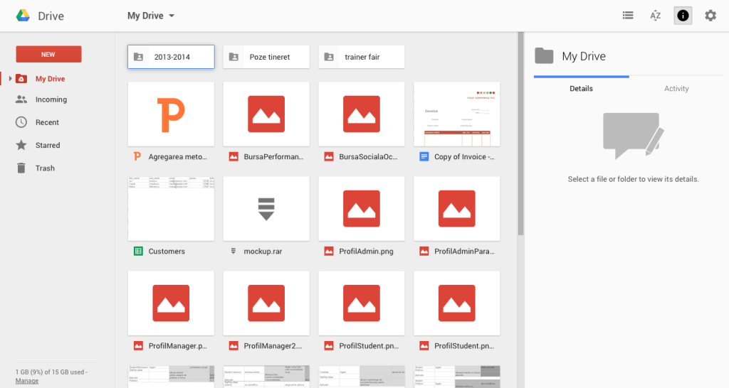
Google Drive Overview
This might be better or worse than the previous version. That’s not completely clear. And by clear, we are suggesting that you cannot easily understand how the elements are arranged, what every item is representing and what is the interaction you can have with them.
The ‘Call to Action’ Button get easily overlooked by the big, red thumbnail images for files.
‘My drive’ opens a selection of actions, so why isn’t it called ‘Actions’ instead?
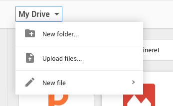
Google Drive My Drive Dropdown
The dialog regarding a file seems non-material design at all, it features the raised button on the left, when it theory it should be a flat button on the right:
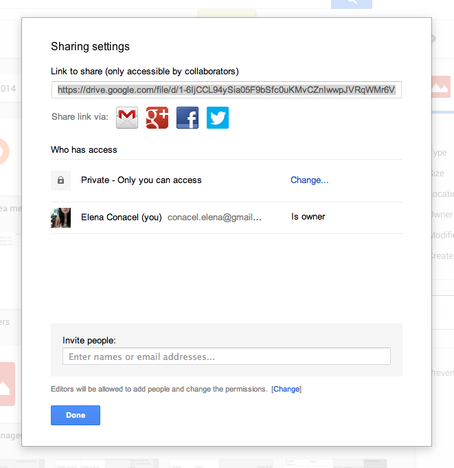
Google Drive Dialog Window
What is up with this tooltip triggered by a second after the click action, coming out of the blue, aligned to the right?
{<13>}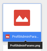

Google Drive Tooltip
The examples could go on, but the general idea just points to the fact that there needs to be something seriously wrong between theory and practice in this particular case. We are fans of the philosophy of the material design and the possibilities that can come with it, but we are yet to see anything consistent implemented with it.
To sum up, reading the Material Design manifesto isn’t a waste of time, but if you want to understand the basics of design, we suggest going back to the roots and learning the essentials steps. Have a look at Don’t Make Me Think, it can teach you a lot. And try to make the most of the Material Design yourself, we are surely going to come up with something special regarding this subject. Stay tuned!

![15+ Top Black Friday & Cyber Monday Deals for Developers and Designers [2023]](/blog/content/images/size/w960/2021/11/black-friday-deals-developers-1.jpg)
