It all started just before the winter holidays when the product owner came over to my desk and said: “We need to redesign the editor”.
He then told me that we need to rethink and redo the Flipsnack editor from scratch because many users abandon it after just a few seconds. He already had some ideas about why that was happening and how it could be fixed.
He discussed this matter with the entire team and everyone agreed that it would be a good idea to start the new year with a hackathon dedicated to the redesign.
Before I continue with the story I should probably provide you with a little context about what it is that we do.
What is Flipsnack?

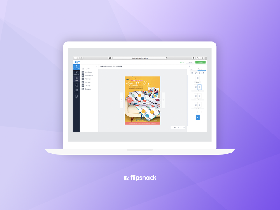
Flipsnack is a digital publishing tool. You upload a PDF and our tool turns it into a digital catalog or magazine – this is the core product. In addition to that, we have the editor which can be used to add all sorts of embellishments to the pages of the flipbook: links, buttons, text, images, videos and many other things.
In fact, it can even be used to design an entire publication from scratch, without a PDF.
The editor has already been redesigned once, by a former colleague of mine. It’s not that he didn’t do a good job because he did. The problem was that people were using it in a different way than we initially anticipated.
To be honest, I was not excited about the redesign. I had so much to do already… but you don’t argue with the boss. However, I managed to postpone this until 2017, when the holiday craziness was over.
Start with Numbers
The best way to approach an app redesign (or any kind of redesign, for that matter) is to look at numbers first. We knew that data is essential so we started by pulling numbers from Google Analytics and checking our own statistics, before doing any sort of planning.
I wanted to design according to our users’ needs and luckily we have access to a lot of data and statistics. I asked for a report for the most used features in the editor. I checked these numbers and talked to our business analyst regarding the user flow on our website and the most common funnels. I wanted to have a very good understanding of our users’ behavior.
Another thing that I found very useful was watching recordings of user sessions in the editor using Hotjar. Watch a few of these, and after a while, you start to notice that the same behavior starts to repeat. Very insightful.
The reports showed us that about 80% of total flipbooks published on Flipsnack are started from PDF. About 35% of our users don’t use the editor at all. They just upload and publish the PDF as it is. The most used item in the editor is the external link, used in 82% of edited premium collections, followed by video and internal links.
The numbers confirmed what we already knew, or suspected. It was time to simplify the editing and publishing process for everyone.
Armed with the research, we made a list of things that we wanted to do differently, for the sake of our users. The main objectives were:
- Simplify the publishing process for the upload – publish funnel
- Make the most used features easier to be found
- Design better for smaller screens (laptop)
These were the 3 main objectives, and as you can see, 2 of them are strictly related to the editor, which became my main focus.
Get out from the comfort zone!
Up until 2017, I have been using Photoshop for all my designs, but I decided it was finally time to make the big move and try Sketch for web design.
I’m a man of habits, and I’m reluctant to try new things. But since the developers were taking on new technologies, it was time for me to get out of my comfort zone as well. I’ve heard many of my peers praise Sketch so I decided to give it a try myself for redesigning the editor.
So, I had a plan and I had a tool. The next step was to start working on some sketches. It took me about 10 days to finish the entire design of the editor, which included all the little details, all the menus, errors, notifications, and popins.
As always, I worked closely with the manager on this project, to ensure that his vision came to life in my designs. Which also meant that I had to redo some things. As soon as the blueprint was ready, we started the hackathon.
It was a 3 weeks long, painful and productive process. We all went to work every day from 9 to 9, from Monday to Saturday. We had 2 meals at work everyday and we had fewer breaks than usual. It was just work – sleep – repeat.
It’s been very exhausting, but at the same time it was a rewarding experience and the best thing about it (I think) is that the entire team worked enthusiastically.
The super power of a hackathon
I don’t know about you or about other teams, but hackathons turn us into these superhumans who do more in a 12 hour work day than we would normally do in 2 x 8-hour work days. There’s something about the urgency of the tasks, staying focused on just one thing, living and breathing design and code, that just simply works.
Of course, we wouldn’t be able to keep up at this pace, but we’ve found it useful to do it once or twice per year. It’s been an incredible team-building experience: we helped each other, we fought (stress does that to you), we made up – just like a family.
As I mentioned, the development team has used new technologies in the new editor: GraphQL, React, Redux, Immutable.js, FlowType and node.js These new technologies helped us build an editor that works smoothly and loads fast. This aligns with our main purpose: make a digital magazine editor that is easy to use and provides great user experience.
In addition to all that, it was also a valuable learning experience for the developers.
At the end of the 3 weeks, we had an almost-ready-to-go-live new editor. It took another week for testing and minor bug fixing because we didn’t want to push on the live server something that doesn’t work well.
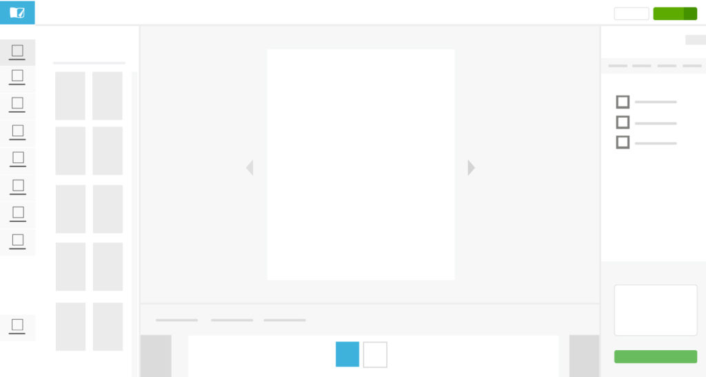
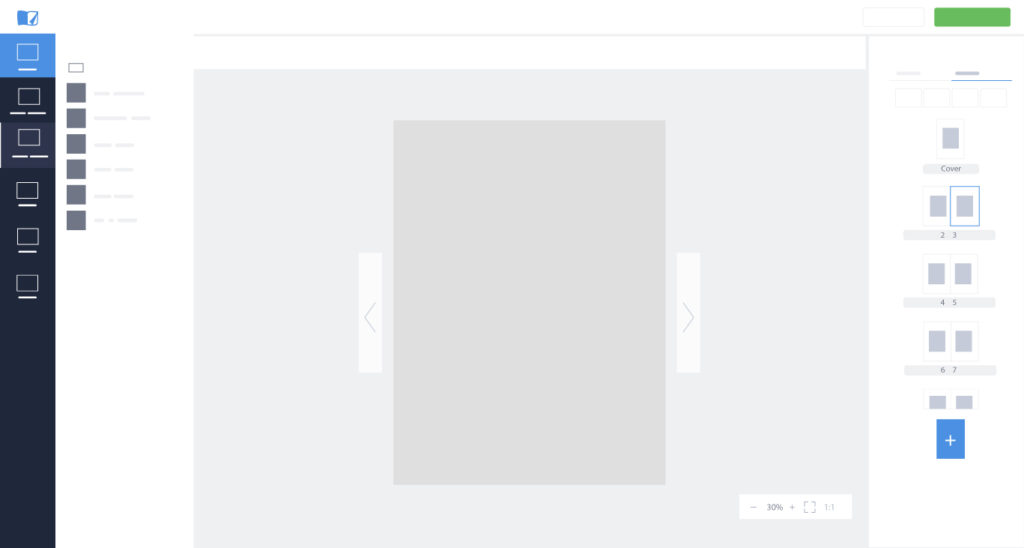
Here’s a before and after comparison.
Below the image, you can see a detailed list of everything that has changed and the reason why we chose to do things the way we did.
BEFORE:
AFTER:
Key improvements
- Better use of space
The old editor was quite inefficient in its use of space, which resulted in poor usability, especially on lower screen resolution devices. The page looked tiny and all the options made the layout feel cluttered and ineffective.
If you take a look at the new layout you will notice that the page is bigger and that it also allows zooming.
- Pages menu is on the left

Most of our users create their PDFs in InDesign, so we decided to place the pages menu on the right, mimicking InDesign’s layout. The new layout is not just a more familiar approach, it has also freed up some space for page editing. Users can add, delete and rearrange pages from the right side menu.
- Quick access to most used features
We organized the items on the left menu by their usage frequency, placing the most used items at the top of the list. We wanted to give users quick access to the most-used features, and I think we accomplished that.
- Page zoom

Users can zoom in and out on the page that they are working on, specify a scaling percentage, fit the page to the size of the current window or view actual size.
- Faster
When it comes to loading times, faster is always better. The new editor responds to all commands promptly (quicker than before), providing greater efficiency.
- Better for smaller screens
The majority of our users are working from laptops, so optimizing for smaller resolution wasn’t optional, it was a necessity.
- Less clutter

By taking out all the less popular elements, we’ve made the interface look less cluttered. The effect is amplified by the smaller side menus and the overall better grouping of features.
Future plans
During the hackathon, we have built an MVP, which doesn’t yet have all the features from the previous version. It’s perfectly sufficient for the majority of our users, but we are aware that we need to think about everyone, not just the 95% of paying customers.
So, the old editor is still available to all users and trying the new editor is optional at this point. It’s presented as a limited beta version.
We are currently working on integrating all the features and functionalities of the old editor into the new one, to have a full redesign. In the meantime, we’re collecting our users’ suggestions and comments through a feedback form directly in-app, which will allow us to further polish and develop the current version.
We’ve also recruited members for an online customer advisory board to serve as a pilot group for all future releases and to provide feedback. We gave 50 active users exclusive early access to “test drive” the new editor and consulted with them regarding the new look and feel. Their feedback was overwhelmingly positive but they saw where there was room for improvement.
There are many different approaches to UI design. It can be driven by intuition or by data, both quantitative (statistics and numbers) and qualitative data (case studies, recordings, focus groups and interviews).
Our goal was to improve people’s experience with our tool, by listening to them and analyzing their behavior.
So… what do you guys think? What would you do differently?
Author: Tibi Jurau, UX/UI design Flipsnack


![15+ Top Black Friday & Cyber Monday Deals for Developers and Designers [2023]](/blog/content/images/size/w960/2021/11/black-friday-deals-developers-1.jpg)
