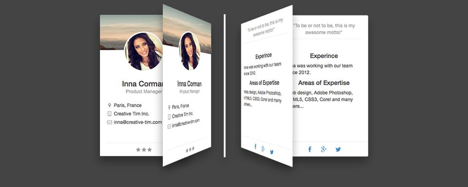
The tutorial below will explain to you step by step how to implement Rotating CSS Card in your webpage. You can get the freebie here.
- Download Rotating CSS Card.
- Unpack zip to certain location on your disk.

- Open x_rotating_card v1.3 folder.
- Create new file and name it sample.html.
- Open the file in an editor and paste the content below:
https://gist.github.com/dawidadach/ac99844b13bbd66fcbf8
Place the code below between the <head> and </head> section:
https://gist.github.com/dawidadach/7346712024c17d15069c
7. Paste the code below between the <body> and </body> section :
https://gist.github.com/dawidadach/08737beca73cf53ff346
That will result in single Rotating CSS card as below:

Note: If you want to create more cards, next to each other copy data starting from <div class=”col-sm-3″> till corresponding end </div> tag. And paste it after.
Note: Col-sm-3 is an example of Grid Bootstrap element. Bootstrap includes a responsive, mobile-first fluid grid system that appropriately scales up to 12 columns as the device or viewport size increases. In a nutshell, you can place 12 columns with size 1 (col-sm-1) or less wide (i.e. 4x col-sm-3). If display allows, they will be shown in 1 line, but if you scale the window down, they displayed one below the other. Read more here:
8. Adjust your card
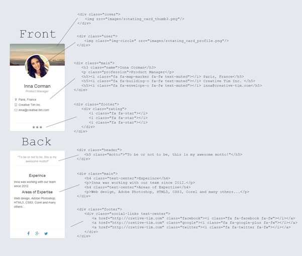
The picture below explains how to adjust certain parts of css card, both front and backside.


![15+ Top Black Friday & Cyber Monday Deals for Developers and Designers [2023]](/blog/content/images/size/w960/2021/11/black-friday-deals-developers-1.jpg)
