If you are looking for inspiration or just curious to see what other people have built with Twitter Bootstrap, you’ve come to the right place.
We have put together a list of sites that look gorgeous and are all based on the same structure. This only goes to show that you are probably better off starting with something like Twitter Bootstrap and investing time into customizing it. From startups to agencies or restaurants, if people were able to make their sites look unique and beautiful, you can probably do the same.
For all the haters saying ‘All Bootstrap sites look the same,’ check out this amazing looking pages!
Twitter Bootstrap Website Exemples
1. PopcornTV
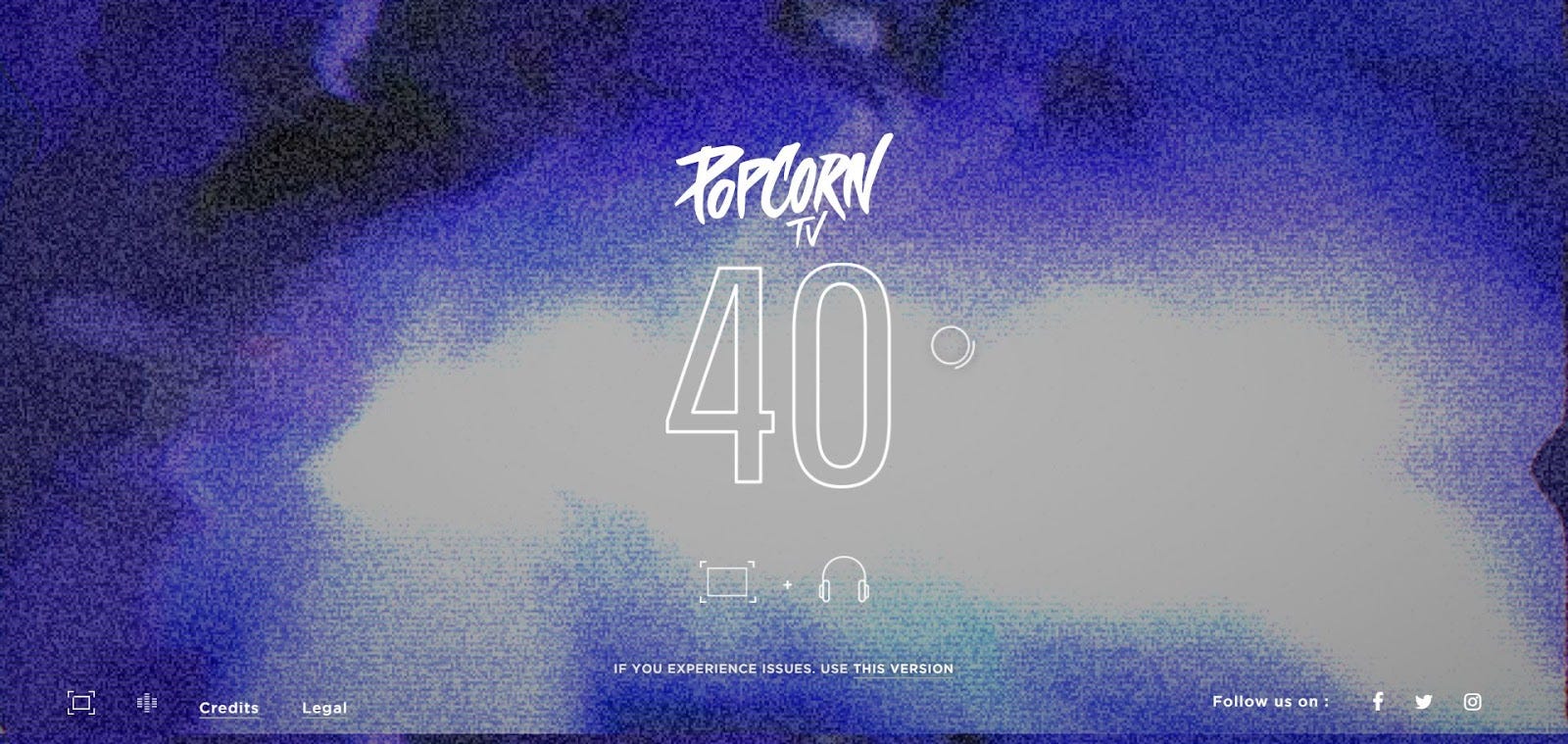
PopCorn Tv acts like a digital quiz that will brighten every Pop-Culture’s bluff day. It’s been a while since we’ve seen such an amazing use of Bootstrap and such amazing web design overall.
2. ClearMotion
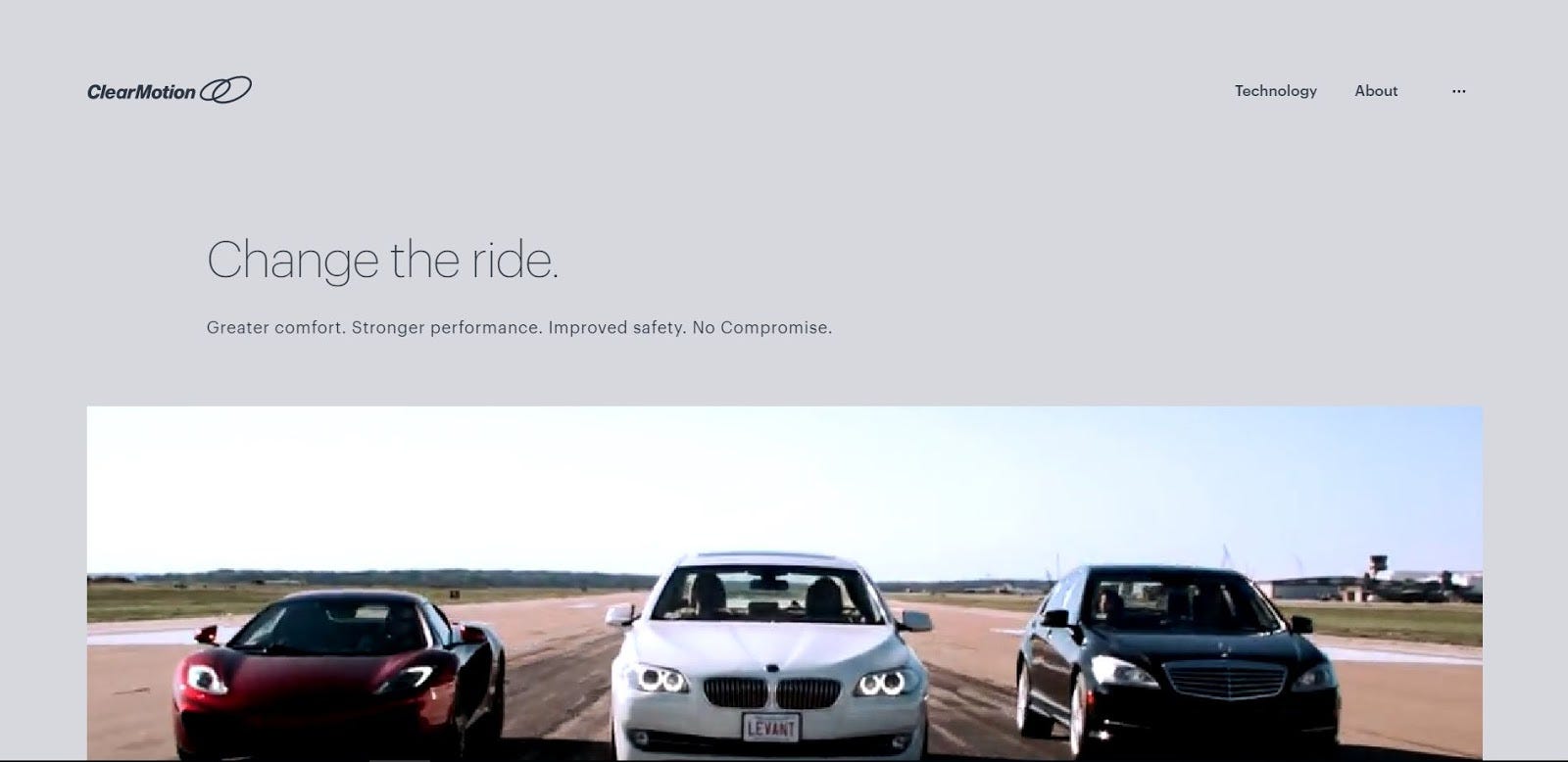
ClearMotion aims to change the driving experience by replacing the shock absorbers of the car with fast-acting software and actuators and continually adjusting the suspension parameters. Their website’s clean design and ingenious use of animation definitely make their presence on this list a must.
3. Paradiso
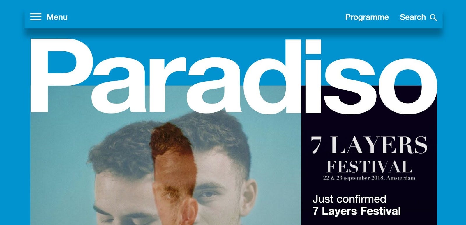
Paradiso is the soul and pop of Netherlands. This cultural center and venue’s website is as cool as you’d expect it to be (and we’re not talking just about the artists featured there).
4. Purnatur
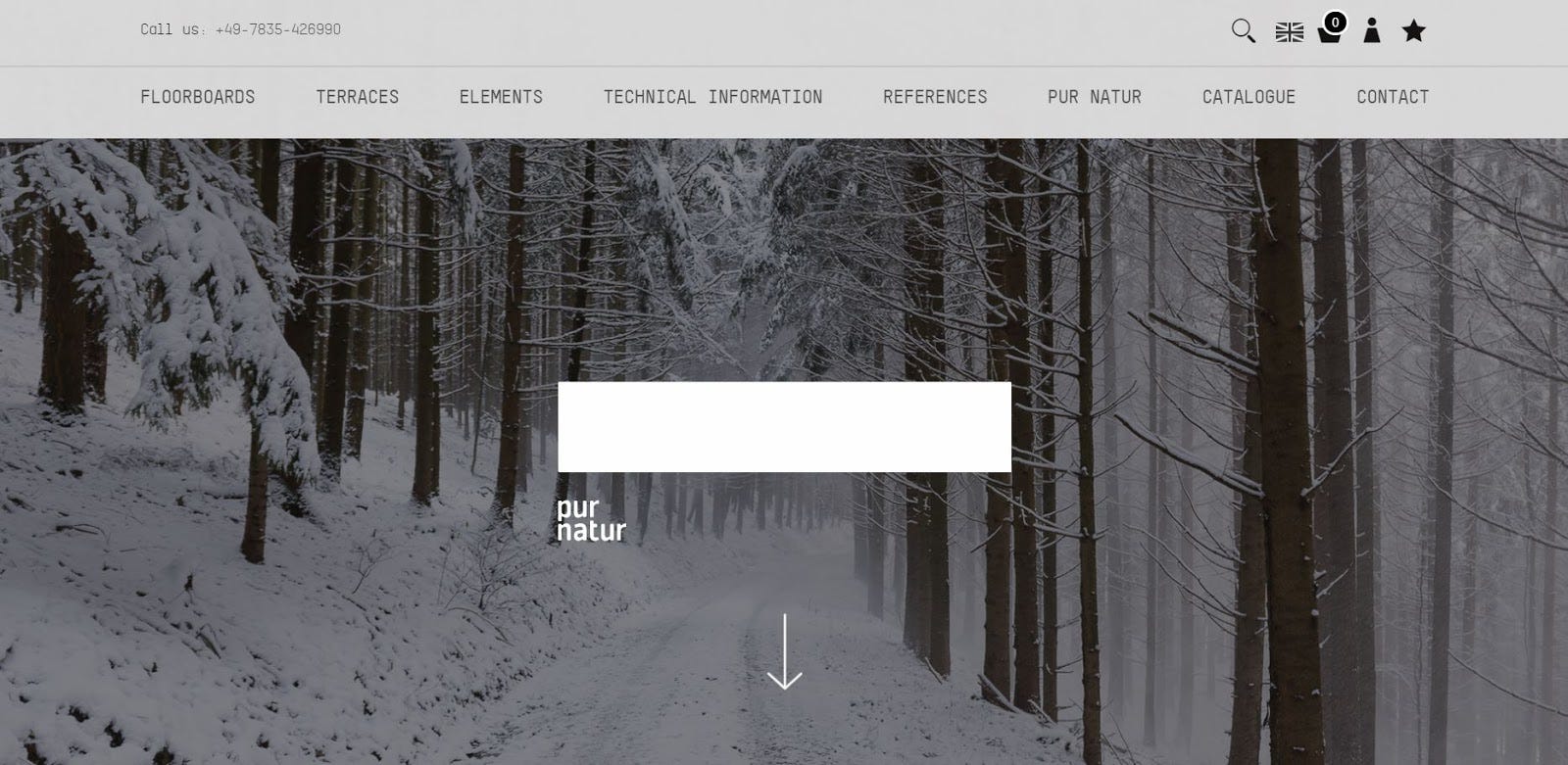
Purnatur will bring nature into your home through beautifully crafted wood floors. Their website reflects their ups, and while navigating it, on you’ll feel the smell of fresh wood as if you’d actually be in the forest. Enjoy its gracious design!
5. Wokine
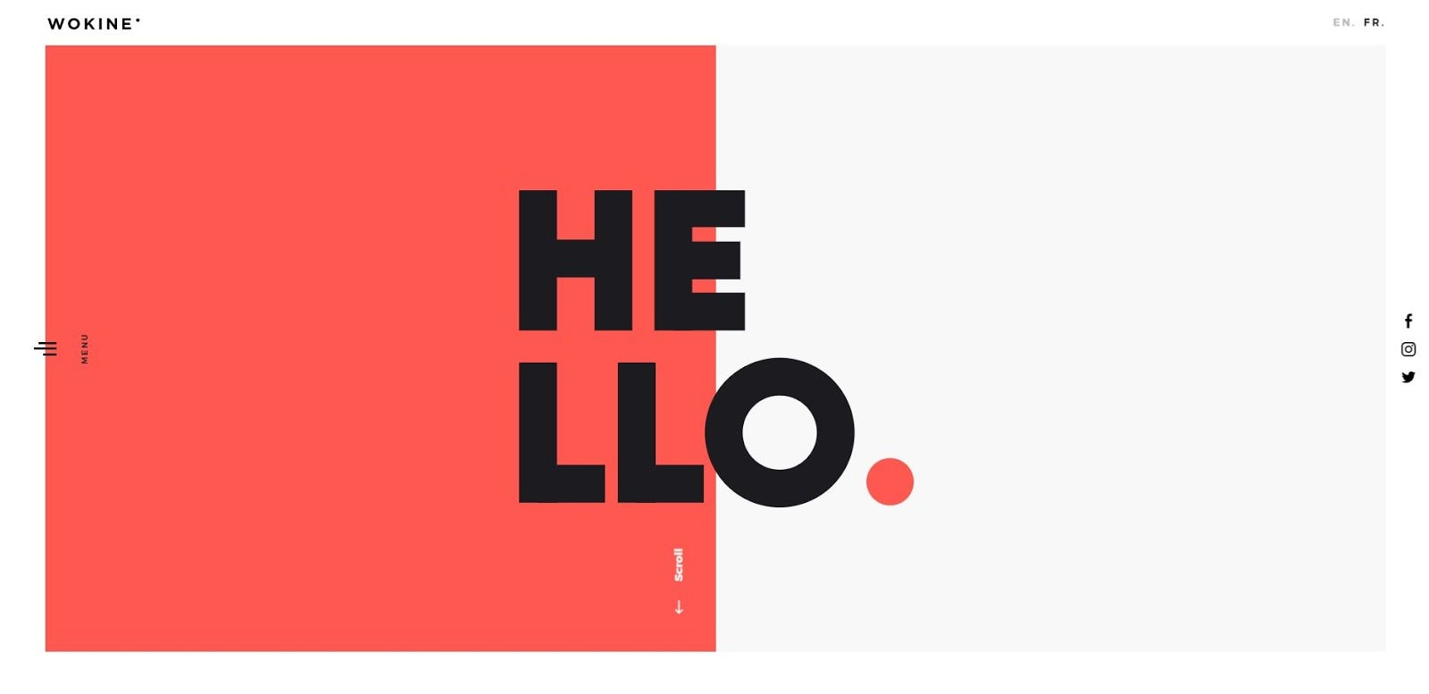
Wokine is a digital agency and startup studio. They provide innovative solutions. We are head over heels about their minimalistic yet practical and efficient website.
6. Wire
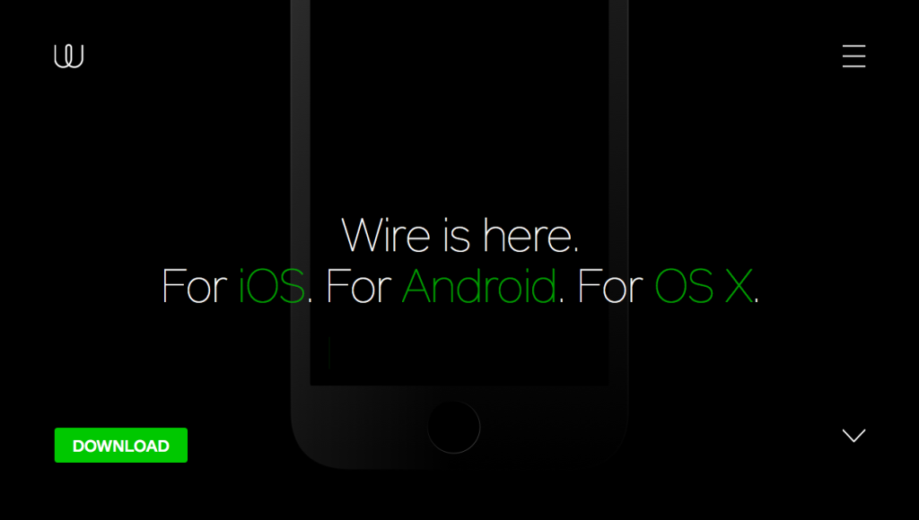
Wire is one of the hot new startups rising up in the messaging space. From typography to colors, we love what they have done over the Twitter Bootstrap structure.
7. Instacart
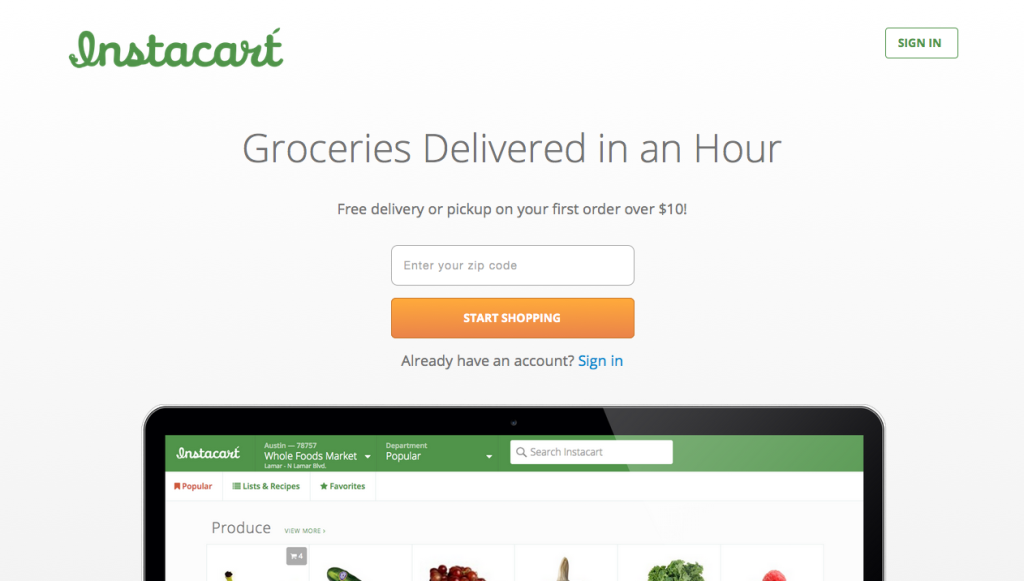
Instacart is a service offering you grocery deliveries. It looks fun and easy to use and creates a nice, cozy feeling. The colors resembling fruits and vegetables definitely get you in the mood for cooking!
8. Reserve
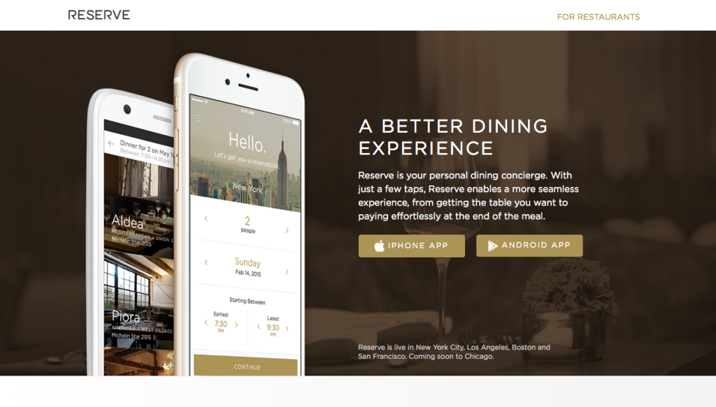
Reserve is the app that turns your meal into a whole experience. The design of the site is elegant and gorgeous, making you feel like you are using a premium service.
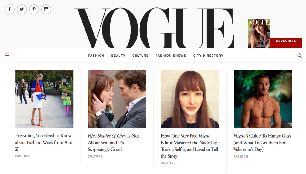
9. Vogue
One of the greatest fashion magazines, Vogue, has built its website with Bootstrap. We think they’ve done a great job creating their online presence!
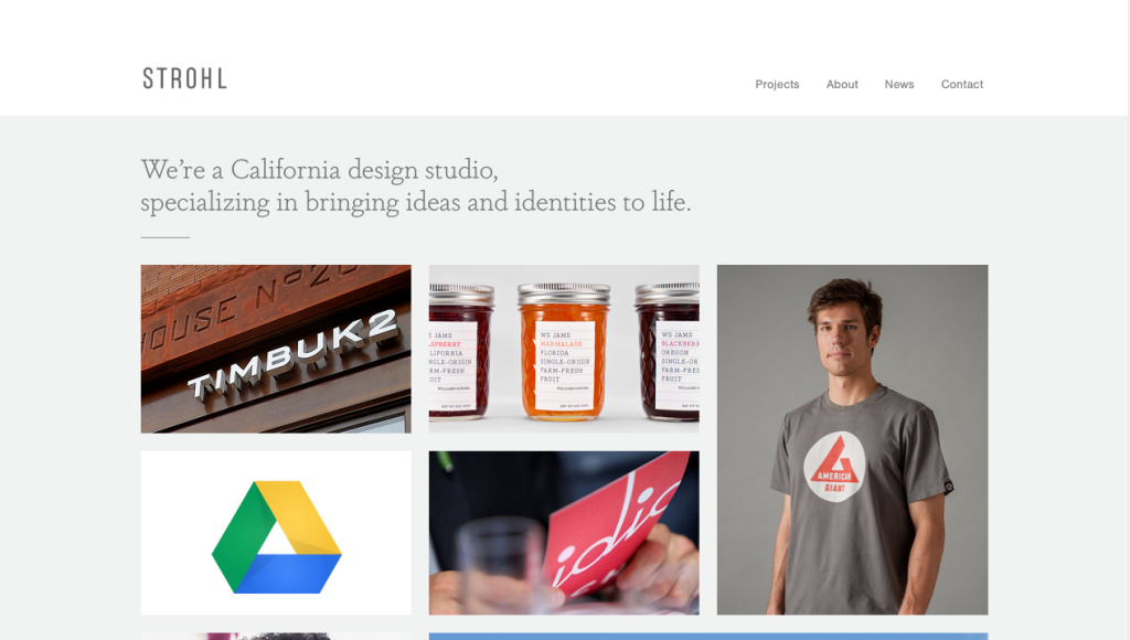
10. Strohl
This design agency website looks great! We like their simple look and structure; and also the amazing work that they do.
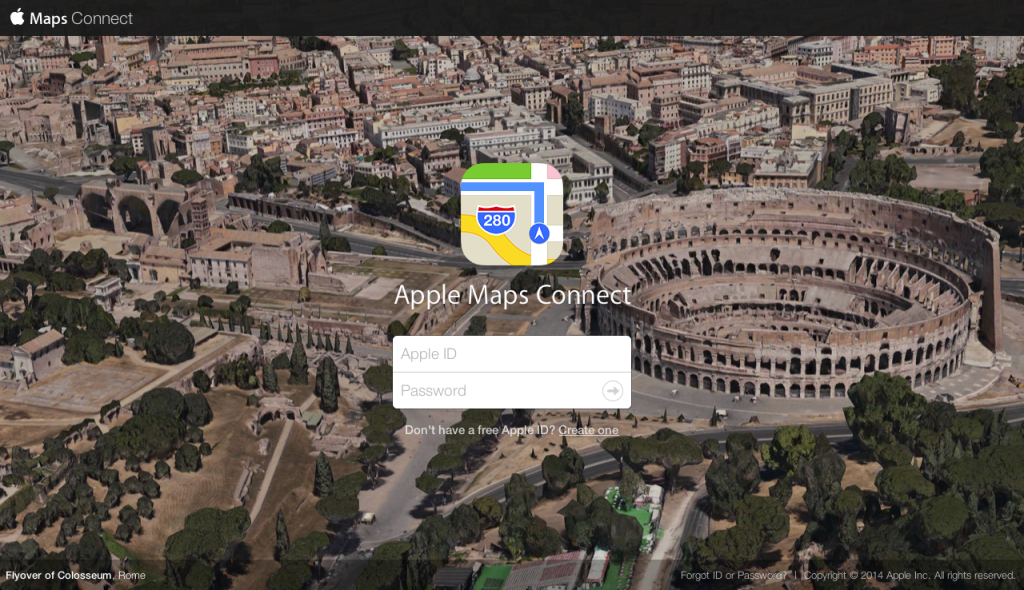
11. Apple maps connect
Aimed at improving the accuracy of the Maps data, Apple launched a new service called Maps Connect. Its rollout has been done quietly and in our opinion, with style!
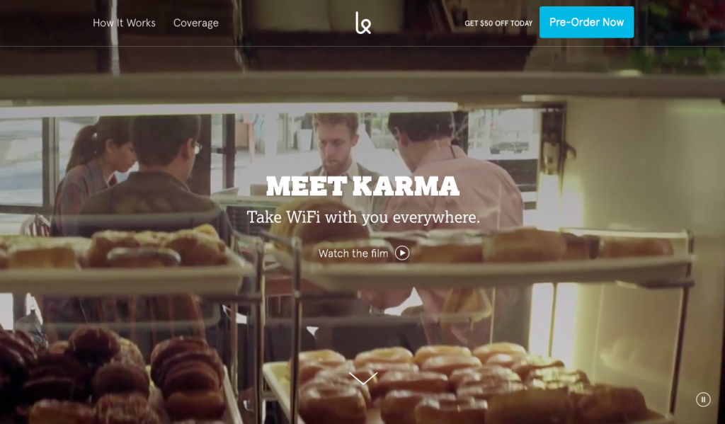
12. Karma
You might already know about this startup from Kickstarter, where it started out. It is a nifty device that enables you to take your wi-fi everywhere you go. Kudos to them for a great product and clean design!
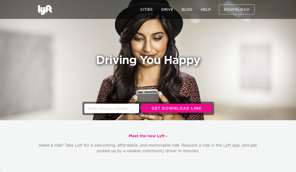
13. Lyft
The car-sharing service that promises to get you a ride whenever is another user of Twitter Bootstrap. Check out how their iconic pink color matches with the simple structure that you are used to!
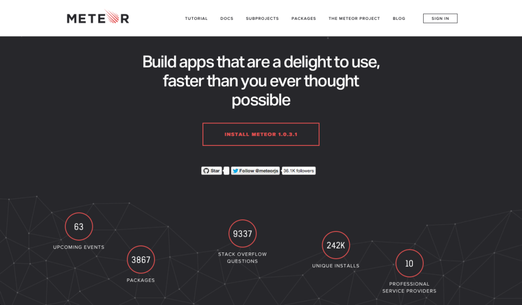
14. Meteor
Meteor is a platform that helps you build web and mobile apps only in Javascript. The service is clear and easy to use, and their design only goes to prove this!
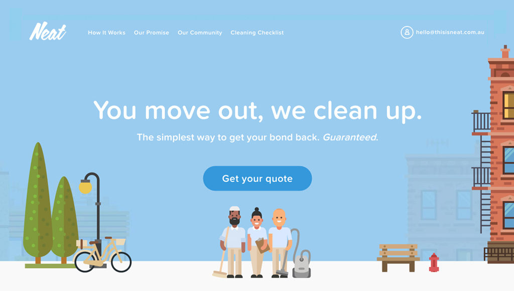
15. This is Neat Cleaning
Aimed at helping Sydney renters clean their homes after moving, This is Neat Cleaning uses the latest Bootstrap 4 to create a very unique and simple design.
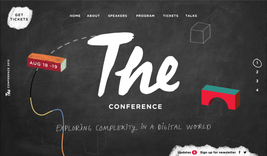
16. The Conference
The 2015 Conference is one of the most interesting takes we have seen on Twitter Bootstrap. It’s clean, yet playful and overall very easy to use. Make sure to get your tickets early!
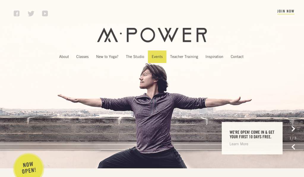
17. M Power Yoga
The look and feel of this website are great! It easily lets you know about their services while keeping a general light design.
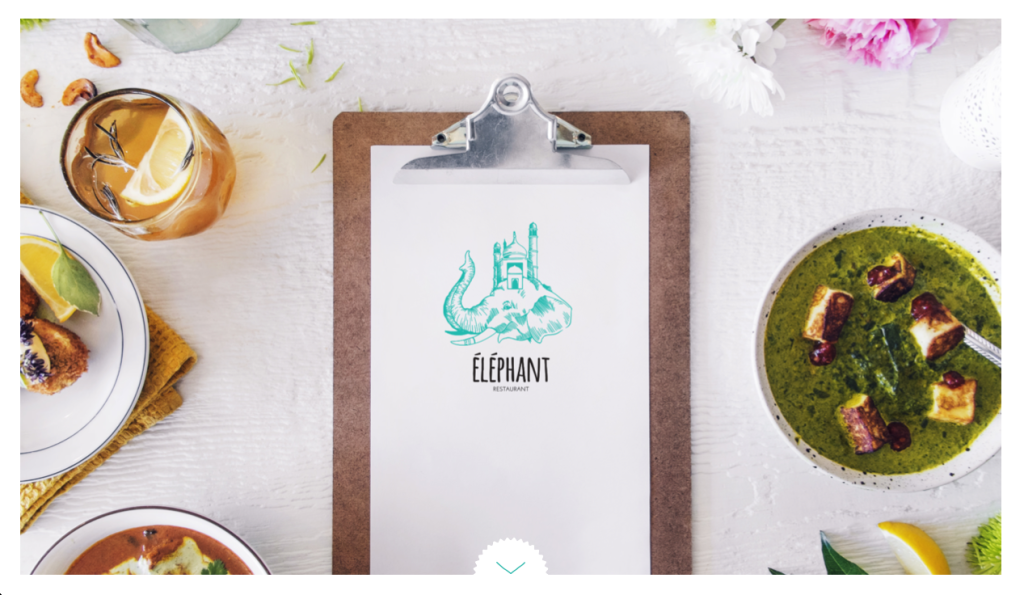
18. Elephant Restaurant
The Elephant Restaurant looks simply amazing. Its’ clear imagery, special fonts, and general layout all look great together!
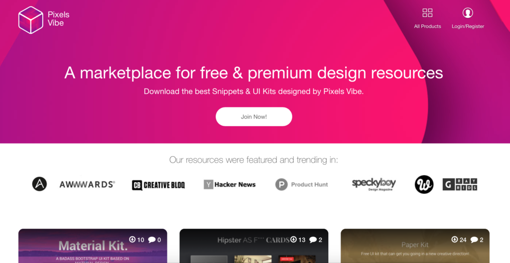
19. Pixels Vibe
The mission at Pixels Vibe is to deliver real&useful designs for real problems. A strong UX background enhanced with UI skills, polished over the years are Pixels Vibe’s weapons.
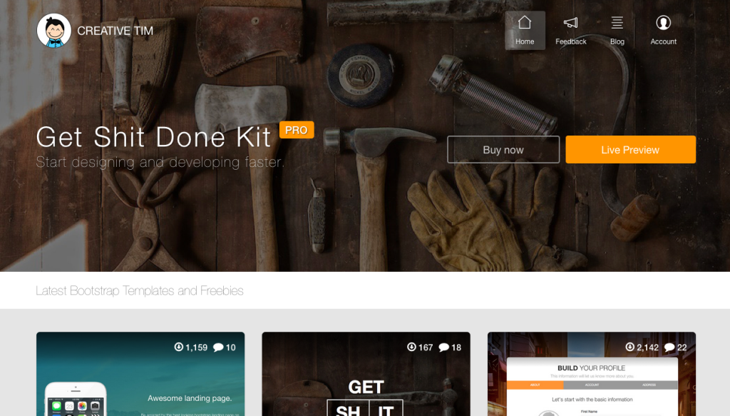
20. Creative Tim
Lastly, we present to you our own site: creative-tim.com. We’re more than proud to showcase our website, built entirely on Bootstrap and customized with love.
These are just a couple of our favorites. You can go to the Bootstrap Expo for more inspiration, the guys curating it do an awesome job. And if you have some more great examples, be sure to leave a comment with the links!


![15+ Top Black Friday & Cyber Monday Deals for Developers and Designers [2023]](/blog/content/images/size/w960/2021/11/black-friday-deals-developers-1.jpg)
