We’ve always wanted to deliver great tools to all the web developers who are using our products. If you want to read more about how we’ve built our business and what is our drive, you can check this article: Growing a side project into a 17k/month business.
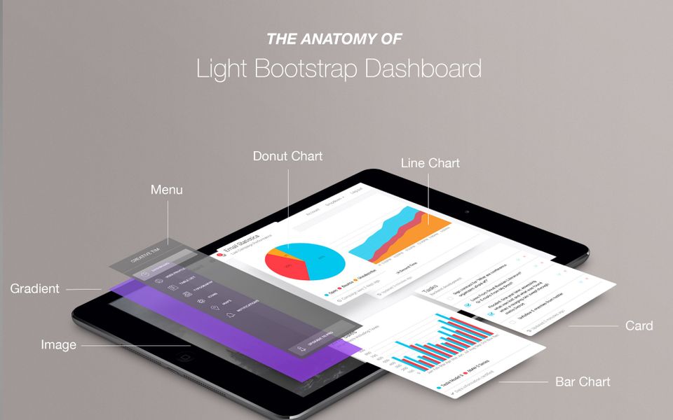
We want to see better websites and web apps on the internet, so we decided to share some of the “secret ingredients” that form the base of one of our most popular dashboards: Light Bootstrap Dashboard. Of course, they won’t be a secret anymore, because we will share them with you.
In this case study, I will share how we got the idea to create a dashboard, where we got inspiration, how we implemented everything, how it was used inside Stanford’s internal tools and how we finance the development and the support of it. Here is an overview of the article:
- The basic structure and core functionality
- How the design was created
- Built on top of open source and why you should stand on shoulders of giants
- Launch, Rise and Shine
- How we finance the support and solve the requests of the developers
- Future development plans
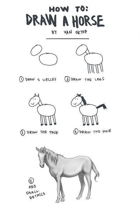
I will try to give as much information as I can so the overall article won’t be like the tutorial about “How to Draw a Horse”.
1. The basic structure and core functionality
You should think of the process behind creating the dashboard as a test that you have to take after you learn a lot. Of course you will also learn a lot during the development of the product, but first, you need to have strong knowledge of what is “that” and how it “is used”. Before writing the first line of code you should do some research, make plans, to-do lists, sketches and try to visualize what you will want to have in the end.
Since you are not reinventing the wheel, you have to look around at companies that create great products to get inspiration (e.g. Heroku, Slack, MailChimp, Stripe) and also your competition. In this way, you will get a lot of information and when you start, it will be easier to develop the product because you did your homework. You have to sharpen your ax, before starting to cut:
“If I had eight hours to chop down a tree, I’d spend six hours sharpening my ax.” — Abraham Lincoln
We did our homework and we’ve got a huge list of over 100 free dashboards as examples from which we can get inspiration, here are some of them:
When you have a huge list of dashboards, with a lot of colors, animations, beautiful icons, small charts, big charts, static/fixed sidebar and hundred of different features, how do you know which is the best option for your audience?
Since we didn’t know what people want inside a dashboard we decided to write down all the features that these dashboards contain and use only the most common of them. We realized that the core features solve around 95% of the cases where you need a dashboard and the remaining 5% solve very specific problems.
On the top of the basic elements (buttons, icons, typography, sidebar, main panel, navbars, dropdowns) the core features in most of the dashboards are these:
- Tables
- Notifications
- Tasks Lists
- Cards (for different type of forms and easier visualization of the information)
- Charts (donut chart, line chart, bar chart)
- Google Maps
Basically, with small visual adjustments, you can reproduce 95% of any dashboard from any company in the world just by using the core elements. Then you have the remaining 5%, which is always different depending on the company and the problems it solves. Here we can find:
- Kanban System Cards
- Drag & Drop functionality
- Timeline components
- WYSIWYG Editor
- 8-Level Navigation Sidebar Menu
- Multi File Uploader + Drag & Drop File Uploader
- Form X-Editable
- Morris Chart, Google Chart, Flot Chart, amChart, Flows Chart and many other types of charts
- And the list can continue to more than 200 features
The problem is that each of these new plugins is adding extra CSS, Javascript/jQuery libraries, and HTML. We’ve built the product on plain HTML no frameworks or modular tricks so all the CSS/JS would be in a single file. Don’t get me wrong, I’m not saying that the features were not good, these are great plugins developed by awesome people, but it wasn’t something that we wanted to have in our simple dashboard. So we decided to keep the product as light as possible (remember the name? Light Bootstrap Dashboard) and we’ve decided to implement only the features that were solving the core 95%.
2. How the design was created
After we made our plan for the elements that the product would have, we had to think of a design that would be outstanding. A user-friendly design that would make people want to have this dashboard inside their content management system. Since we already had the famous Bootstrap Get Shit Done Kit, which was loved by web developers and has been downloaded more than 30,000 times, we decided to use that as the core design for basic elements like Buttons, Navbars, Inputs, etc.
We realized that we need more than that though, to make an impact and to make people badly want our product. We didn’t want to be “another dashboard based on Bootstrap”. Where do you go when you want great design resource?
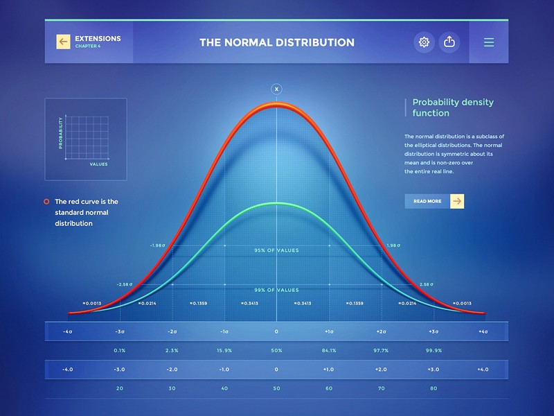
If you search “dashboard” on Dribbble, you will find a lot of incredibly beautiful dashboards and admin panels. Actually, for those who don’t know, Dribbble is like visual cocaine. For example, check some of these examples made by Cosmin Capitanu and Mike from CreativeMints:
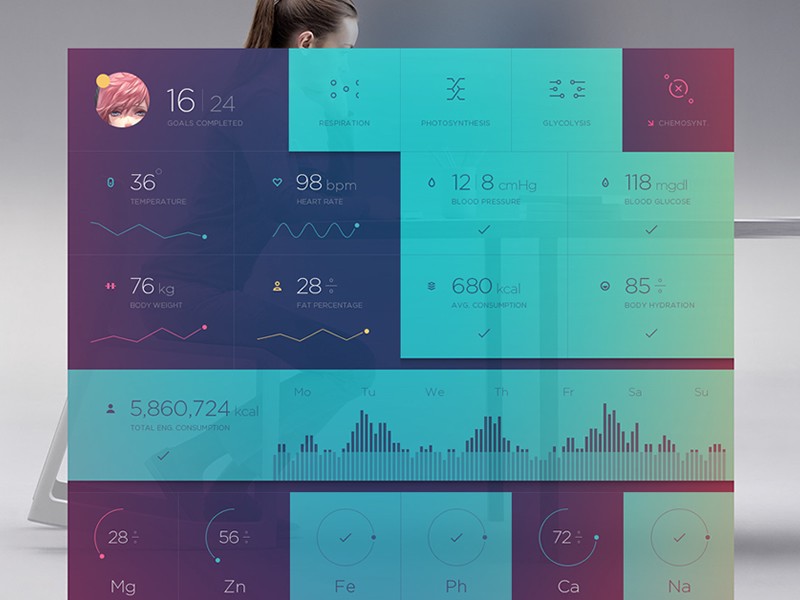
Seeing all these beautiful examples we realized that if we build something like that we will definitely stand out of the crowd. Also, we’ve noticed that even if the dashboards or the charts are looking very good, they will be very hard or impossible for us to actually code in HTML/CSS/JS. Or they are solving a very specific problem, like the latest dashboard with Body Measurements.
It was impossible 2 years ago because our level of knowledge and experience with HTML/CSS wasn’t so high. I’m sure that if we‘d like to implement them today, we’d have a good chance of creating something very similar. Also, the technology and browser capacities will help us more.
We wanted to build something that can be used by many people from diverse business fields. There were also some simple and beautiful dashboards too, but we didn’t want to use them as inspiration because we wanted something different.
I can’t explain exactly what we wanted, but we didn’t feel comfortable with any of the examples. So we continued to do our research until we found something that we really liked:

Heroku Dashboard in 2015
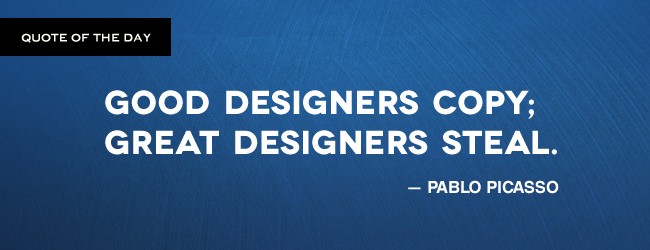
It wasn’t perfect nor as outstanding as we wanted it to be, but we felt that it is the right choice and it is a very good example from which we can build our dashboard. Even Pablo Picasso said that great designers steal and Apple respected this word:
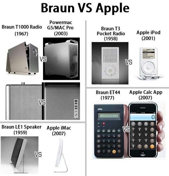
We couldn’t do that. The dashboard from Heroku was good enough that it just gave us that spark, so we decided to use it only for inspiration and not for the final result. Here is the first iteration:
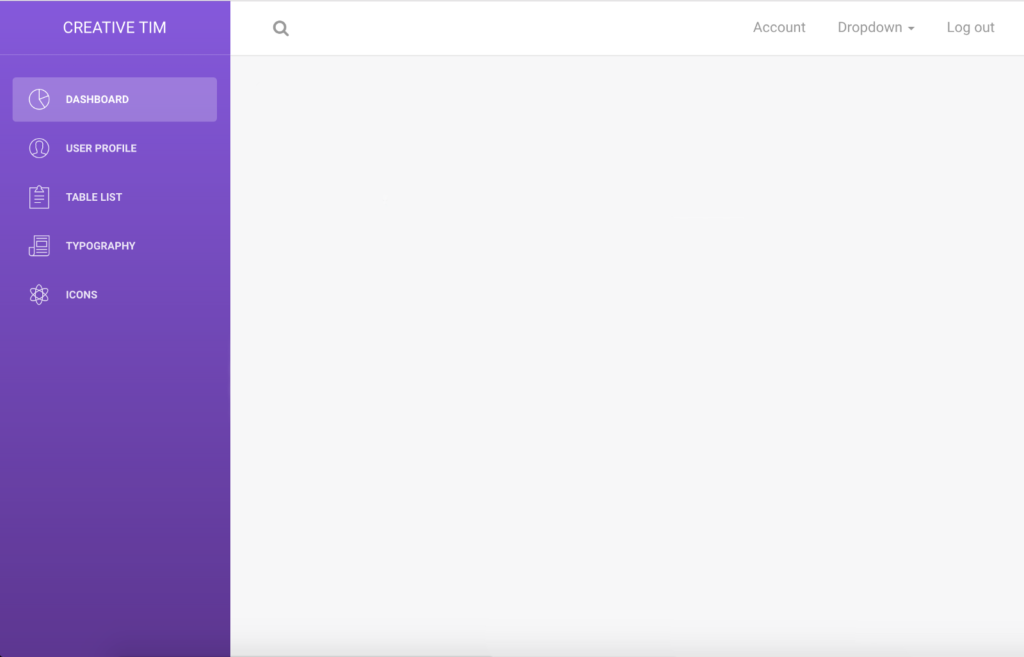
Iteration #1
It’s a pretty good start. To have a better view of how it will look, we just have to populate the right area with some cards with charts:
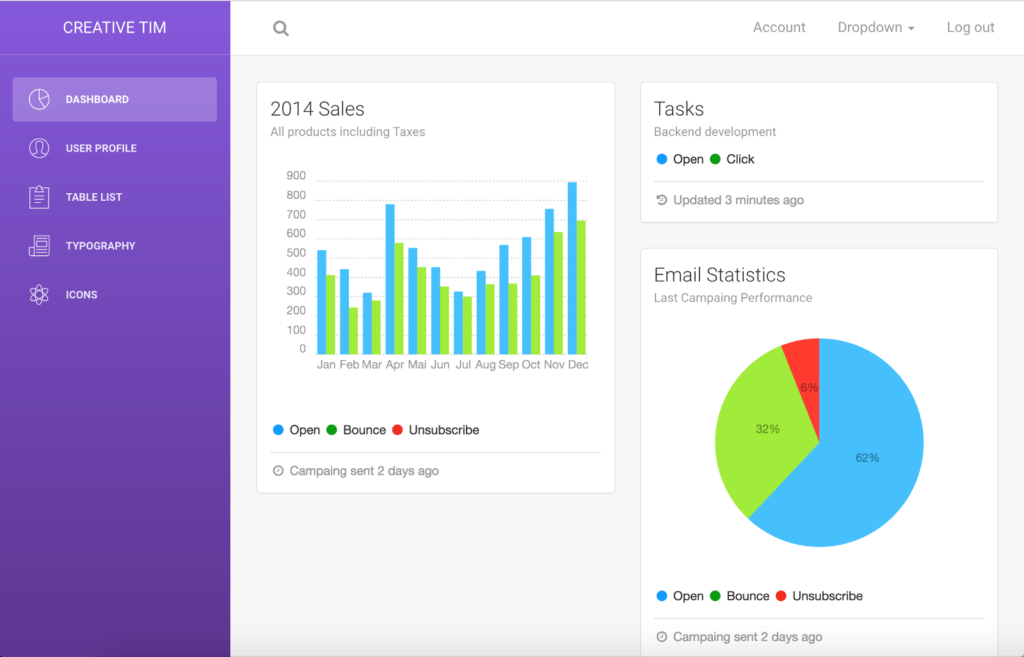
Iteration #2
The cards’ colors didn’t look so good, they were too bright for how the left sidebar was looking, so we started to test different combinations of colors for the charts and the sidebar.
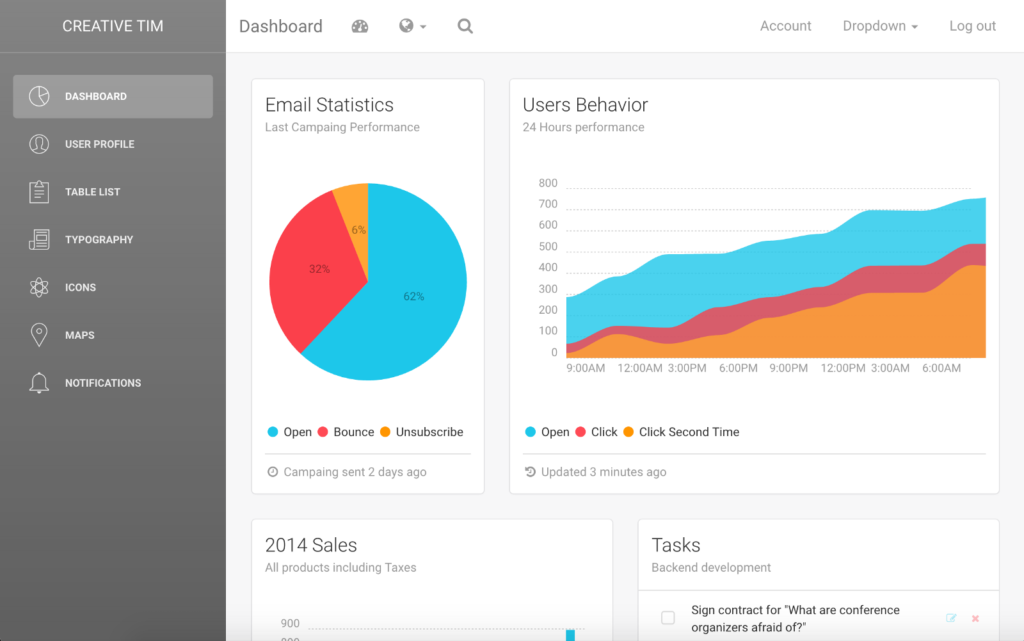
Iteration #3
At this point, we realized that we don’t have to keep only 1 color for the sidebar’s background and we should let our users choose which color they want. We knew that Apple had some beautiful gradients for their Fitness App so we decided to use those gradients as the base for our future gradients.
We’ve always thought that if we are watching what the best companies in the world are doing, in terms of Design and UX, we will set very high standards for our interfaces. In this way, more and more web developers will have free access to high-quality products.
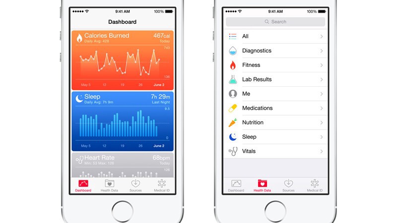
Apple’s Fitness App
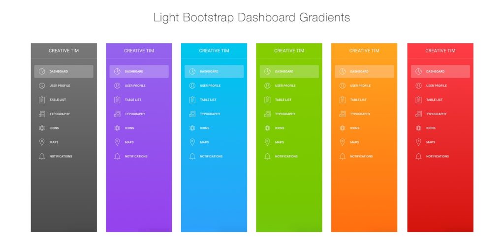
While we were doing all these different combinations of colors, gradients, cards, and charts we saw that the guys from Metalab, who built the interface for Slack, wrote an article: Slack’s $2.8 Billion Dollar Secret Sauce. This ended up being an inspiration for the next steps. The overall idea of the article is that Slack’s secret sauce is created by the combination of a great and playful interface with small interactions, which makes the product more user-friendly.
“It looks different, it feels different and it sounds different.”
So we wanted to add something that none of the other dashboards had. I’ve always loved how a gradient with some transparency can look over an image and I’ve started to play with different images and gradient’s opacity. BTW, the Duotone Gradient Image that we used in 2015 (we didn’t even know that it has a name) seems to be one of the trends in web design for 2017. This is pretty cool, isn’t it?

Iteration #4
Not fully satisfied…

Final iteration
This was the view that made us feel happy, it was just perfect for us. We also added small interactions like the opening drop-down animation or the show effect of the notification.
Adding the image with the gradients over and the small animations made us feel like this guy:

3. Built on top of open source and why you should stand on the shoulders of giants
As we said in the beginning, we didn’t want to reinvent the wheel nor did we have the money to contract experts capable of building the elements needed for the dashboard. We decided that the best option for us is to use what other people created and shared for free or open source.
We recently discovered that what we actually did was stand on the shoulders of giants. That means we used as much as we could from tools that are already powerful and well maintained by big communities. More about this and why you should use this technique when you want to build something from scratch can be read on this awesome article, written by Quincy Larson: How to stand on shoulders of giants.
Let’s have a look at what is actually under the hood.
- Framework: Bootstrap — Bootstrap is the most popular HTML, CSS, and JS framework for developing responsive, mobile first projects on the web.
- Design Layer: Get Shit Done Kit — Free Bootstrap 3 UI Kit, the best starting point for any online project you are building. It has become a trademark for the online community of a clean and nice looking interface.
- Font: Roboto — a Google Font that has a dual nature. It has a mechanical skeleton and the forms are largely geometric.
- Small icons: Font Awesome — Font Awesome gives you scalable vector icons that can instantly be customized using CSS.
- Large icons: Stroke 7 Icons — This is a complete set of 202 thin stroke icons inspired by iOS 7.
- Charts: Chartist.js — Chartist.js is the product of a community that was disappointed about the abilities provided by other charting libraries.
- Notifications: Bootstrap Notify — This plugin helps you turn standard bootstrap alerts into “growl” like notifications.
- Maps: Google Maps — Plugin for viewing maps.
- Photos: Unsplash — Free (do whatever you want) high-resolution photos.
“There is no such thing as something for nothing. Everything, including your personal success, has a price that must be paid” — Napoleon Hill
Since we used a lot from the community it would be fair to give back to the community, so we decided a couple of weeks ago to release it under MIT License. In this way, more developers can contribute and use it without any legal constraints, for personal and commercial projects.
4. Launch, Rise and Shine
Doing the research for around 50-60 days (sharpening the ax) gave us the possibility to develop the dashboard in just 15 days (chopping the tree).

What do you do after you launch a project? You need to see what the feedback for it is, if people would like to use it and if the simple dashboard you created is solving a problem for them. If they don’t want to use it, then, you don’t have a business. We submitted it on different communities and it was doing very well. For example, it got:
- 170 upvotes on Hacker News, peak to position 9 and over 88.000 views for that week
- 247 upvotes on /r/webdev subreddit
- 80 upvotes on /r/web_design subreddit (blocked at 80 because it got the “spam” tag, we had some subscribe popups… which we later removed)
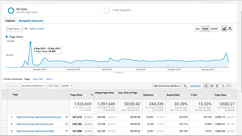
The community validated the idea. We’ve also got a lot of feedback, to add the SASS files for easier customization or post it on Github.
Then we’ve seen that there were a lot of beginners who just wanted to learn how to use this dashboard. It was so beautiful that people who didn’t interact with something like that wanted to learn how to work with it. So we spent around 3 weeks to develop a series of video tutorials on how to replicate the WordPress dashboard using our product. We chose to use the WordPress dashboard because it is a very popular dashboard and we wanted to let people understand that they can build anything using our product. The tutorials were very well received and have over 78.000 views as of today. Here is the first video on How to create a responsive admin template using Light Bootstrap Dashboard 1/3.
5. How we finance the support and requests from the web developers
Building a product it easy, keeping it alive is hard.
There are a lot of great plugins/template out there which are dying because their creators don’t have enough cash or they don’t make enough revenue in order to continue the development or to fix the issues. We didn’t want the same case for our product. The best option to keep the product alive was to create a PRO version which can generate enough revenue to support to continuous development.
We used the feedback that we’ve got from web developers and we decided to create a Premium version with more elements and plugins. We wanted to help also some of the guys who wanted specific features and were in the 5% category. Choosing the right plugins which can help as much as we could from the 5% category was very hard for us. We started again to do research on the premium dashboard and we added plugins like Full Calendar, DataTables.net, Sweet Alert, Bootstrap Wizard and some extra pages like Login Page, Register Page, Lock Page.
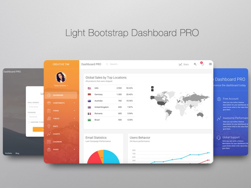
Here is the live preview of the PRO version. You will see that we kept the same structure and wanted to make it light, without too many options and features.
Having the revenue from the PRO version made us not only support the product but also create new file types like the PSD/Sketch version or Angular 2 version, both are shared for free.
6. Future development plans
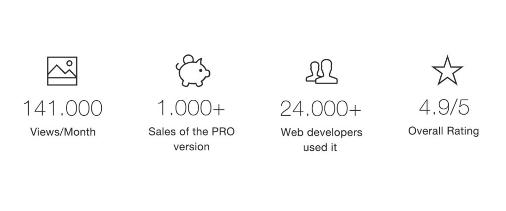
Here are some stats about the dashboard:
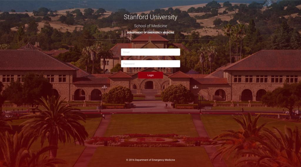
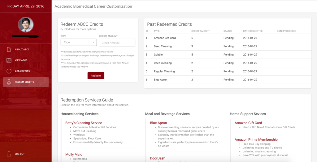
It is very easy to customize it to match your brand and it was used in internal tools like Stanford’s Department of Emergency Medicine Catalogue:
We’ve got many requests from web developers who want to have the Dashboard built on different frameworks like Angular 2, Angular CLI, React, Meteor, VueJS or as a Rails Gem. Creating all these versions and supporting them for free under MIT license will work only if we will have PRO versions for each one. We started with Angular 2 and we’ve seen a lot of people who use it and we’ve got a lot of feedback on how to improve it. So if you want to get involved for the other frameworks or if you have any ideas on how to make these products better, we would be glad to talk more.
It took a lot of courage to show our sources and the process that we had behind building Light Bootstrap Dashboard. Hope you will learn something from this and if you have any feedback or suggestions, I would be glad to talk to you in the comments.
Useful links:
- Download HTML version from www.creative-tim.com
- Download Angular version from www.creative-tim.com
- Download PSD/Sketch version from www.pixelsvibe.com
- Play with it on the live preview
- Contribute and report issues on the GitHub repository
Find me on:
- Email: [email protected]
- Facebook: https://www.facebook.com/axelut
- Twitter: https://twitter.com/axelut




![15+ Top Black Friday & Cyber Monday Deals for Developers and Designers [2023]](/blog/content/images/size/w960/2021/11/black-friday-deals-developers-1.jpg)
