70% of the buying experience depends on the user experience, which is the key factor to differentiating you from your competitors. 50% of websites get only 15 seconds of attention, says Tony Haile, CEO of Chartbeat. 88% of users will not return to your website after a bad experience. 88% is BIG. But again, all is not lost. Marketers are increasingly doing a revamp of their marketing strategy with UX as their core focus. It is important to understand the user a bit more before we jump on the UX bandwagon.
In this digital-first world, a good user experience has become a user magnet. Check out how brands create powerful UX magnets to grab the attention of their users. The beaten to death techniques and approaches are no longer applicable in the world where the users have the reign.
User experience is an overall experience of a person with a product or a service. Though this is not a science, a common touchpoint is attainable. It has become a challenge to exceed the human perception threshold. Improving user experience is a never-ending process due to its dynamic nature, but the first principles remain the same –
- Utility
- Ease of use
- Efficiency
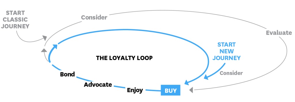
Source : David C. Edelmn and Marc Singer , Competing On Customer Journeys
The decision journey shows that the user considers and evaluates before he thinks of making a purchase. User experience is a critical aspect while considering a purchase. The users need to find what they are looking for and perform a function easily. There are many factors that can help you achieve an amazing user engagement. Let’s look at them one by one.
Creating a powerful on site experience
There are numerous ways to measure performance; there are so many metrics and overlapping solutions. A user centric approach needs to be implemented rather than just showcasing what you are all about. The Chrome team brought out a model called the ‘RAIL’, which has made it easier to improve user experience with 4 actions. It helps to track UX metrics and measure the effectiveness of user interface.
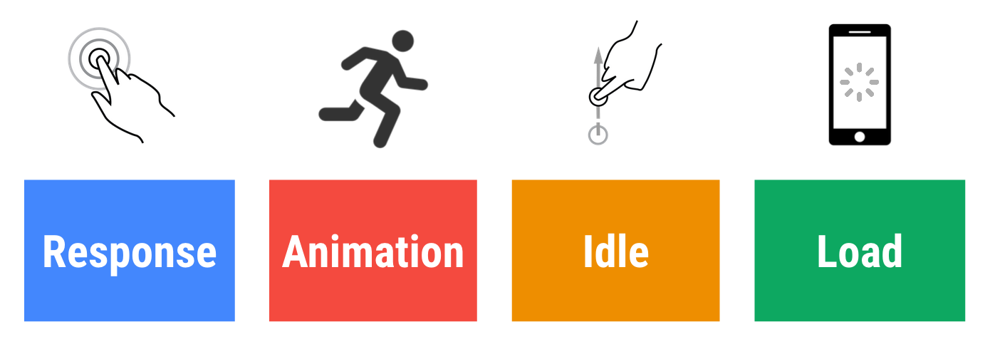
It is not a race against time, it is a race to make the users happy, which should be your ultimate goal. Response is the time taken from tap to paint, which means once a user clicks on a button, the time taken for the website to react on it. The ideal response to an input is less than 100ms.
Animation is almost always present on a website, from dragging to scrolling to transactions. How would you feel when you are zooming in on a map to find out a location and it freezes mid zoom. Yes, I can understand the pain. Or imagine you are reading an interesting article and you are not able to scroll down to the best part? How do you make sure this doesn’t happen? A lag in animations can be quickly sensed by the user as they are presently active on the page. A smooth interaction needs to be weaved to provide uninterrupted experience. To achieve this, each frame needs to be completed within 16ms which gives 60 frames per second.
Idle is typically the work that takes place when the browser is idle; the background work that takes place even when it is not needed at load. To handle the next input, information is necessary, which is what idle is all about. Even when the user is not interacting the thread should be available if an interaction takes place. To avoid creating a long thread log, it was found that it needed to be broken down into blocks of 50ms.
Load time plays a vital role in providing the user with the first meaningful and responsive paint of your website. To load the page quickly, 1 second is the time taken into consideration. Once a website fails to do so, users will start to waver. 40% abandon websites if the load time is more than 3 sec. So why take chances!
How To Improve On Boarding Experience
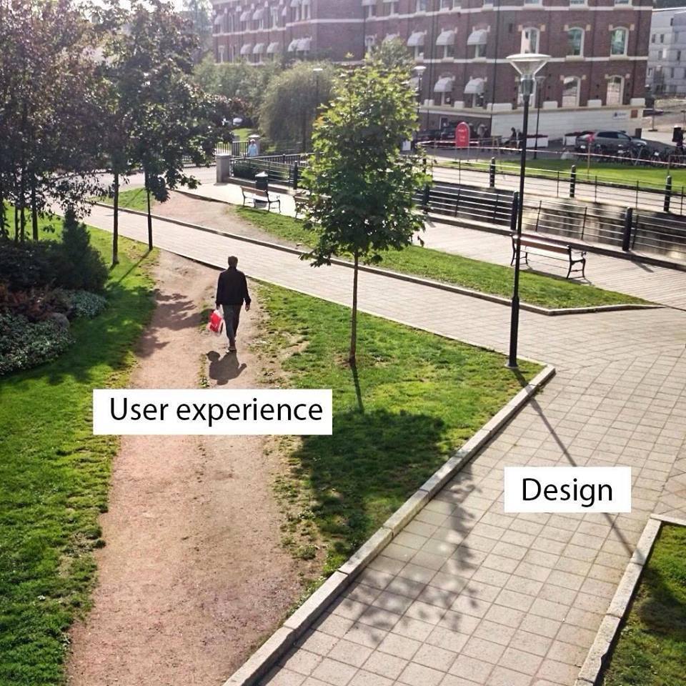
Once the user visits your site you have to impress them within seconds. Once you have checked all the action in the RAIL, you need to concentrate on design. Design plays an important role in helping users navigate easily and provide them with everything they are looking for. It is seen that designers and developers are often thinking from the brands perspective rather than the user’s. It is necessary to get into the user’s shoes to know how to design it efficiently.
What is the point if the users are not receiving what they came for. You might have an amazing design, no doubt, but is it worth it, if the user can’t make any sense. You need to make it easier for them at every step, almost as if you are reading their mind. Make it convenient and guide them throughout the way. The design needs to depend on the type of industry you are in.
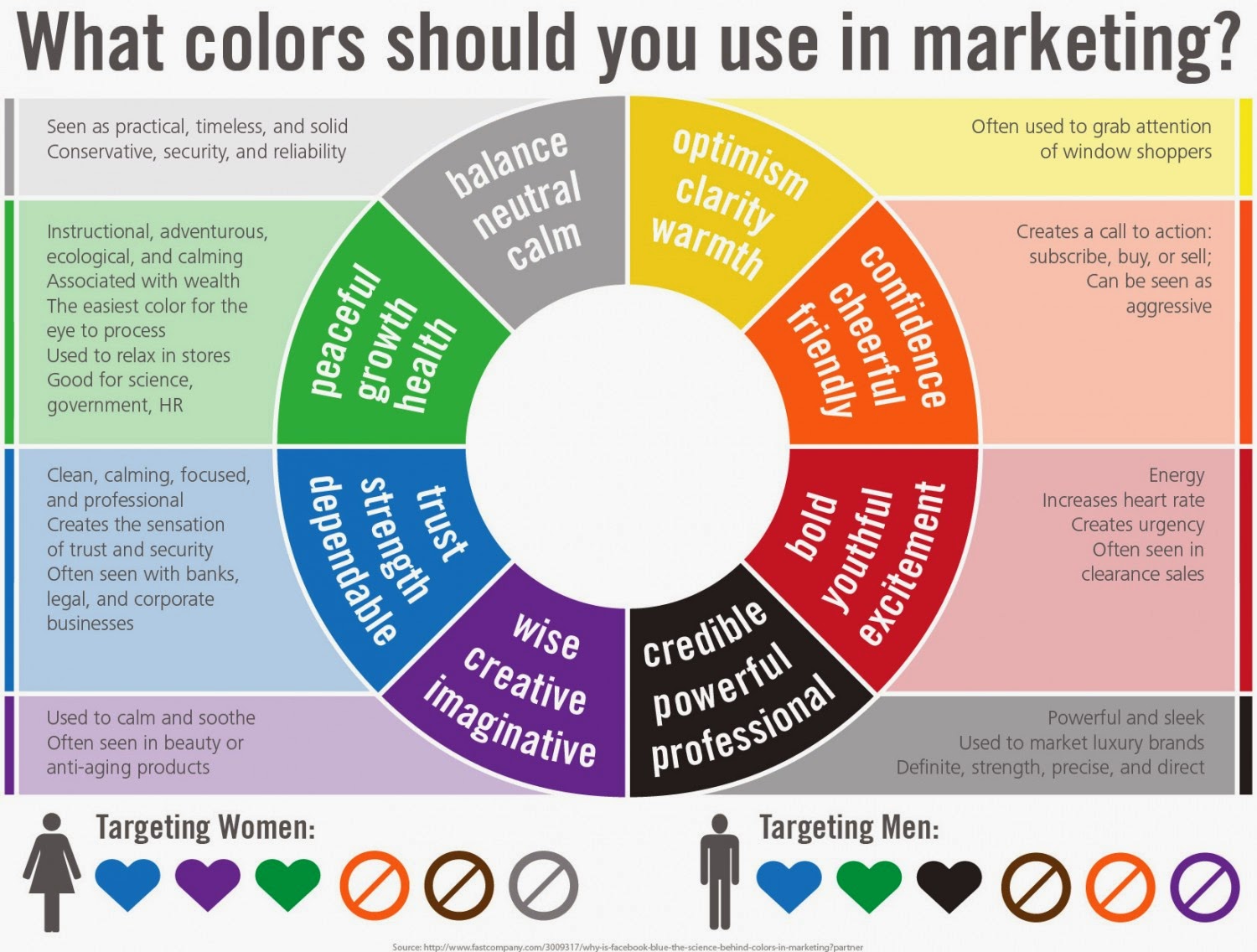
Colour psychology also plays a vital role in luring the user and retaining them. Colour choices helps in illustrating your brand image. Different color signifies different aspects of your brand and as every industry should take notice of the colour that would compliment their brand image.
You need to segregate your target audience from the rest of the crowd so that you can cater them according to their persona. Personalization is yet another major aspect of UX; that helps you create an instant connection. You need to mold your approach according to your user. Keep tabs on their browsing habits to give them relevant information. The whole point is to make the user appreciate your efforts and consider you as a reliable brand. Amazon is one of the best examples when it comes to putting personalization into act. They had collected years of data and came up with users also bought. ‘Sections like you might also like‘ shows that you know in and out to provide them with suggestions.
Once you have caught their attention, it is time to engage them. Once users find your website interesting, they would automatically engage better. You need to create opportunities for them to interact with you. Retaining users is the next step once you have got them engaged.
How Can You Engage, Re-Engage And Retain Your Users?
A whopping 78% of marketers believe that engagement takes place in the middle or at the end of the marketing funnel. You could escalate user experience by communicating efficiently to your user. If a user has just visited your website and they want to communicate with you, you can set up an on page chat to address all the users queries instantly. Quick responses impress the users leading to an amazing user experience.
Well, there are numerous channels at your disposal that will give you a helping hand when it comes to engaging and retaining users. Emails are a good way to send elaborate information about the sale you are conducting, an event that is going to take place, transactional details and so on. Emails help in sending in detail updates, by which the users can absorb all the information there is. They receive a CTR of 1%-5%.
SMS is channel that can be used to reach out to the users even when they are not on the internet. Users can be informed and the messages can be saved for further reference. They receive a CTR of 20%- 30%.
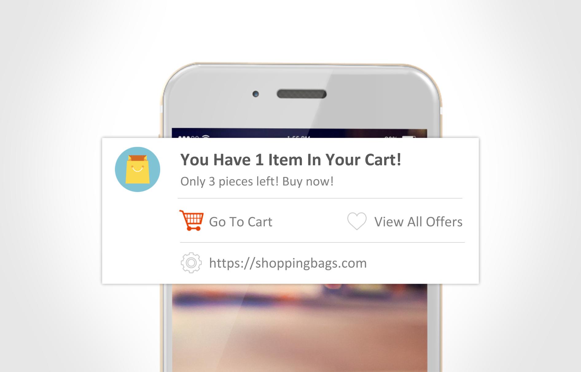
On the other hand website push notifications are bite size updates that are sent across desktop and mobile to the users even when they are not on the website. As they don’t cram up space, it becomes an widely accepted channel to send constant updates to a user especially during transaction to keep the users in the loop. One can also send updates pre sale, during the sale and post sale just like Jabong does. With web push, the user gets to know the gist of the information without having to go through a large amount of text. You can also engage the users in the first go by sending them a welcome notification, showing that you appreciate them. With amazing customization and personalization features it allows you to segment users and send local time notification which it makes it possible to reach the right audience at the right time. Even though browser push notifications are new in the marketing world, it receives a CTR of 20%- 30% and is highly cost effective.
You need to compare these marketing channels to know which one would suit your business best.
Metrics you need to measure user engagement
Though there is no one universal metric to measure user engagement, a few can be looked at to see where you are leading with the users. List a few objectives, keep an eye on your goal and check your outcome. An increase in your website traffic does not mean that users are having a good experience. You need to keep track of the bounce rate and time spent on site as well. You can keep a track of your subscribers; who have opted in for receiving emails, sms or web push to know who are really interested.
You need to check the retention rate and churn rate. Observe your acquisition channels to know what channels are effective in bring in users. Goal conversion rate needs to be calculate to see how many users have successfully turned into customers as they have had a good user experience. It is a Key Performance Indicator (KPI) to know how the users are reacting and why where they are dropping off. Lifetime value is yet another metric to see how many loyal users you have who keep visiting your website, sharing it on social media and making a transaction.
Analyse your conversion funnel to know how many users who visit your site finally convert. One of the best way to monitor is by google analytics and KPI can be measured by Cohort analysis. Finally, you can check your reviews the users give and always ask for feedback so that you know where you are going wrong and what you can do to create a better user experience.
Author Bio
Pravya is a Product Marketer at iZooto. In love with animals more than humans, obsessed with amazing hair and educating the world about digital marketing. She secretly is mastering the art of stone balancing. Amidst all of this, she also squeezes out time to paint on canvas. Her dream is to go on a bike trip to the highest motorable road. She writes often on the iZooto blog.
Twitter handle- @pavipravin
@iZootoTeam
LinkedIn – https://www.linkedin.com/in/pravya-pravin-a98b1269?trk=hp-identity-photo
Facebook – https://www.facebook.com/pravya.pravin


![15+ Top Black Friday & Cyber Monday Deals for Developers and Designers [2023]](/blog/content/images/size/w960/2021/11/black-friday-deals-developers-1.jpg)
